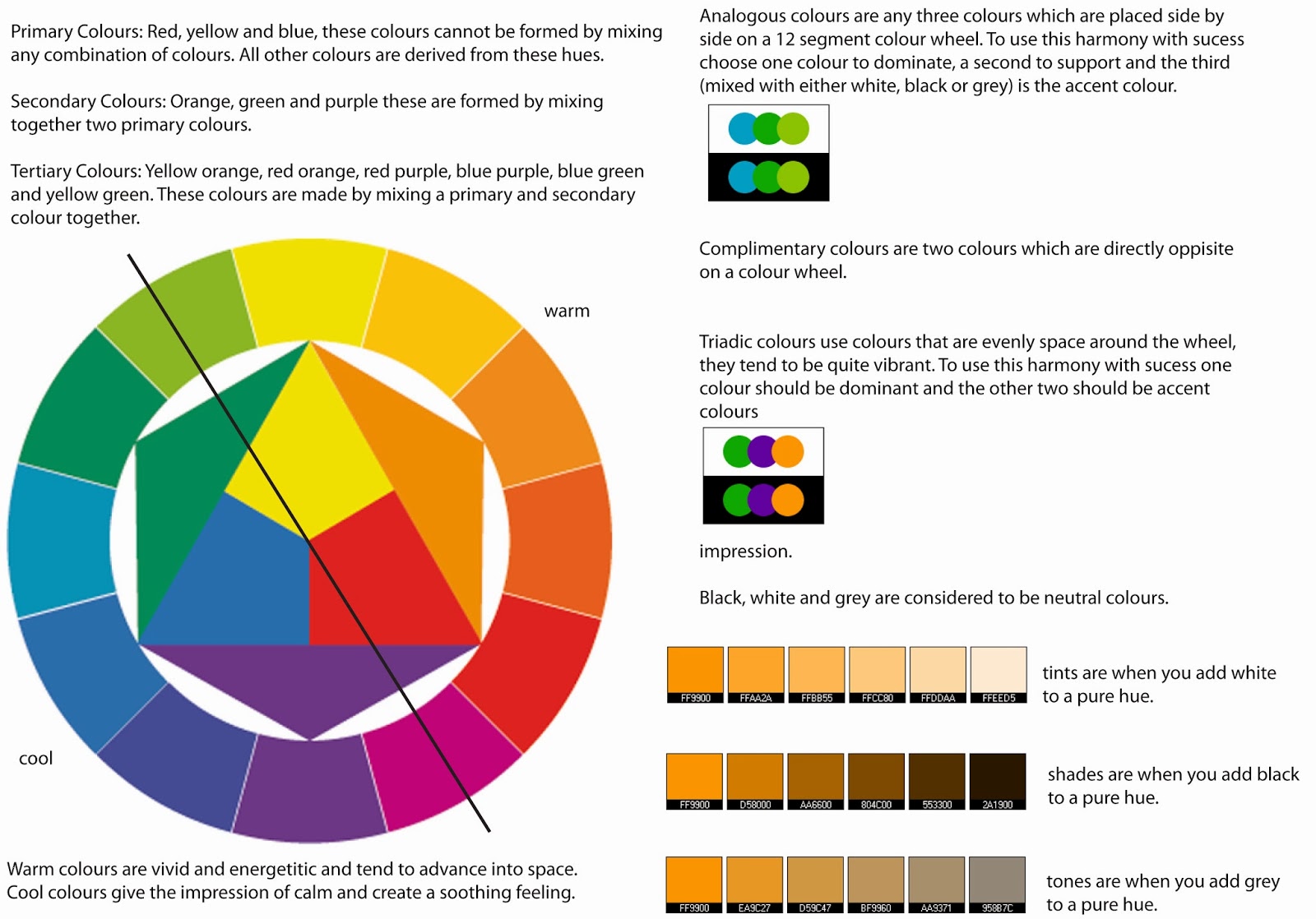
When preparing for the design stages for my brief, I had a colour theory lesson. I got given an electronic version of the colour wheel document. I looked at primary, secondary and tertiary colours, situated on a twelve sector colour wheel. I found this fairly easy, as it is basic knowledge, however when looking at the end of lesson test, I got three questions wrong because I got confused on tones, shades and tints. The black line running through the middle of the colour wheel splits the wheel into warm and cool colours. The warm colours would be great if they are used in the designs as they are very bold, vibrant colours. However, they could be too overpowering, therefore I would need to think of the different shades and tones I use in order to create a comfortable feeling in the refectory. The cool colours create a calmer, more sophisticated atmosphere, therefore the students and adults would feel more mature. The colours used need to create a great vibe in the refectory, inviting the students in and relaxing with their friends etc.
We were allocated to a partner, and using this pattern, create three different coloured images. In the first image, we used two complementary colours, pure red and green. The red brings a vibrant feel against the darker green, as the two colours stand out from each other. These two colours are often related to Christmas, therefore they may not necessarily work in the refectory, as it might show off a different personality trait to what we were aiming for. My eyes are drawn into the middle, then pulled back out again from the red, however my eyes then follow towards the corners, which brings it all back in a again. A similar design or colour to this pattern may put off students and adults if this was created for a logo or on a menu board.

In the second image, we used two different complementary colours, lighter shades of orange and blue. This makes me think of the beach, the sand and the sea, which could create a calm, relaxed feel towards the students. The pattern is a lot easier to look at, as the tones are not so bold and bright. They bring you in towards the pattern enough to feel relaxed, lazy and day dreamy, which could be incorporated in the design stages for the refectory. This could be good as students would want to relax after working hard beforehand. Beaches are very spacious, relaxing and lively places, which is what I want to reflect in the designs. Because of this, I could take this idea forward and see how it plans out.

The last image that we had to create was by using analogous colours, These are three colours that are placed with each other on a 12 sector colour wheel. We chose blue-green as the dominant colour, using it as the background colour. For our supporting colour, we used pure green as this is a cool colour, and lastly we added a lighter tint to the blue-green for the accent colour. These three colours create a soft feel on the pattern, making it easy for my eyes to look at. The pure green areas definitely pull me in towards the middle and out again, and some areas look like they are moving. This could work really well for the mood setting and the atmosphere that I want to create, as the tones used are very cool, and pull you in at the same time, therefore pulling you into the refectory.

I found this work really fun and informative, as I am able to incorporate this in my design development. I could create a funky atmosphere, with crazy, vibrant colours. However, I could use softer tones of the warm or cool colours to create a more calm, sophisticated feel. I want the students to feel that they are comfortable when relaxing in this environment, because this is their main hub/area to meet their friends and eat.
No comments:
Post a Comment