Overall, I am happy with my final video. I feel that the effects that I added to the type works well, as they are slow enough for the audience to read, but also fast enough so that the video doesn't lag on too much. I feel that the colours that I used were bright, and exciting, therefore making the audience fully aware of the video and mentally and physically being pulled in.
I think that by drawing out and scanning in the font type styles, it gave the video a more funky vibe, which would come across as more fun to the audience. I am pretty happy with the whole puzzle piece idea as it shows that Dunstable can come together as one. I used puzzle pieces that connected to others as it shows that more pieces should join, therefore more people should come visit Dunstable, everyone uniting.
I feel that my video captures most of the good aspects in Dunstable, however I would have liked to add a bit more of the exciting side, such as the night life and restaurants etc. as this would have made it more fun to watch and more informative. I am also aware that the images that I used were very blurry, which made the video low quality.
If I was to repeat this outcome, I would use higher quality images and maybe used the images in full, rather than in a puzzle shape, as this is what caused the blur. I really liked the idea of the puzzle shapes although it didn't really work well with the images.
https://www.youtube.com/watch?v=bRvXJXRHB9w&feature=youtu.be
I feel a little annoyed that the images move too fast, making the video hard to watch in a relaxed manner, however I feel that the concept works really well. I feel that the for puzzle pieces coming into the middle throughout the video is a little off-putting, making the type harder for ear and understand, making the audience feel confused, making them leave without watching the full video. If I was to repeat this idea, I would make sure that the four puzzle pieces are only shown at the end of the film, rather than throughout, as it would look a lot neater.
Monday 14 April 2014
Monday 7 April 2014
Process Of Final Outcome
I took screenshots of the process of making my video, using the software Adobe After Effects. I included audio, Upside Down my Paloma Faith. I feel that the process went well, seeing as I have never used the software before. I feel that I was challenged to create a good motion video, therefore my final outcome wasn't as good as I has hoped it would be.

Artists Of Influence
I researched a couple of artists from the brief sheet, as well as researching my own, who I am inspired by. These were Arctic Monkeys, Motion typography - Rocky Balboa Inspirational Speech, Colonelblimp.com - Julio Bashmore - Peppermint, Bad Meets Evil - Fast Lane.
Arctic Monkeys - Do I Wanna Know:
Their video for 'Do I Wanna Know' was directed by David Wilson, with animation agency 'Blinkink'. This was first released on the 18th of June 2013, and has had over 40 million views. The video starts with a simple, black background and simple, white visuals of sound waves in synchronisation to the voice of the band's vocalist Alex Turner, to illustrate the beat of the song. Other colours of waves appear as the song progresses, vibrating to different tracks of the song's instruments. It turns into faster, full colour animations of women, car races, birds, fish and others. Towards the end of the music video, scenes transition between each other through a black screen with a white wave stretching from one side to the other, reminiscent of the opening scenes. The last scene is the same with the white line on a black background, however it forms the letters 'AM' in the middle of the screen. The white lines against the black background creates a moody, dull atmosphere. I feel that the lines portray the mouth of the singers in the band. I feel that the wider and longer the white lines get on the screen, the longer the note is on the actual song. When the second colour is added to the video it shows that there is another voice in the song. The sky blue that they have used can also show a dreamy feeling towards the viewer. When the two other primary colours join in the video, it creates a better vibe to the video. The colours can be used to show different kinds of emotions that the people in the relationship went through. The colour blue could be shown as dreamy, yellow as happy, white as boring and red as angry. When the women walks in, she shows power and aggression. This is shown by the way she stomps in with her high heal boots. The way in which she walks in time with the beat of the music works well as it creates tension. The clothes that the women wear are very sexual, which also show power over the males, female dominance. The animations are all line drawings making the video fun and flow with the beat and lyrics of the song. When the four colours show up on the screen, I feel that it portrays the feelings of the people in the relationship even further as there is a lot more going on, which is why the beat is faster, and therefore stronger. The variety of women shown in this video definitely gives me the fact that the women overpower the males, and in a way overpowering the relationship. The crazy things that happen in the video towards then end, shows me the bad times of the relationship, as there are mental line drawing animations and colours splashing everywhere on the screen. By the end of the video, the relationship is made up with a kiss and the beginning scene is shown back on. This could show the cycle of the relationship and their love.
Do I Wanna Know Video
Motion Typography - Rocky Balboa Inspirational Speech:
The black type against the white and grey background creates a moody vibe as the colours are boring. The type used is very simple, and by using a large point size, the message should get to the viewers more effectively and quickly. The voice over creates a heavy, scary sound over the video, which creates tension, making me and the viewers listen and understand what they are trying to say. I feel that the video plays very fast, making it hard for me and/or the viewers to read and understand it. In my opinion, I don't feel very inspired, as the voice-over does not give me much enthusiasm. It sounds pretty boring, making me lose concentration. However, I do feel that the different point sizes of the phases create hierarchy. This therefore makes it more effective and easier to read and understand the video. I feel like there is a lot going on, making it hard for me to stay focused on the video.
Speech Video
Colonelblimp.com - Julio Bashmore - Peppermint:
Noah Harris, a graphic designer, designed a video for Bashmore's Peppermint, propelling us into the eye of a golden storm of his own conception in this psychedelic and elemental promo. From the all-seeing clapping hands in the heavens to the gold and paper underworld below, this video is an extreme descent into a deep, immersive chasm of in-camera graphic design and propulsive stop-frame animation. This could be seen as a stop-frame animated exploration of evolution by the progression oh house music over the decades, or it could be a video of purely a whirlwind of sex, drugs and the religion of wave. I feel that the imagery used is very creative, however does come across as mental. The different shapes at the beginning create a funky vibe with the music. The different colours used create a calm atmosphere. The lips at the beginning of the video creates a story, showing how a female is created, The illusions and illustrations going on in the background work well in time with the music. The colours are the same all the way through the video, making the video flow in a smooth matter.
Peppermint Video
Bad Meets Evil - Fast Lane:
The video was shot in mid-may in 2011, by director James Larese of music video direction group Syndrome. The music video features animated visuals and kinetic typography, also including cameo appearances of Mr. Porter and Slaughterhouse. Royce da 5'9" and Eminem both interacted with the animations and occasionally hold and use them as actual 3D objects. When transitioning between rappers, Eminem and Royce da 5'9" push each other out when it's their turn. Shot in an old warehouse, the video ends with the two art its being pushed out of the way by the Bad Meets Evil logo. The video became very notable for its humorous content.
I feel that the different type styles used goes well with the imagery and illustrations, because they create a crazy, funky vibe with the song and the lyrics. The motion graphics element starts as soon as the video comes on, which easily captures the viewers attention straight away. every style of type is different, making the video eye catching. The motion graphics makes the viewer want to watch the video all the way through, as it flows well with the lyrics of the song. Type is shown in the video as soon as it starts, introducing the name of the artists, already capturing my attention.
Fast Lane Video
Tesco Advertising Campaign
The beginning of the video is funky, as the graphics element flows well around the images. The background music creates a relaxed feel to the video, especially when gliding through the images and text. The speed of the video is great, as the viewers are able to understand the aim of the video quickly and easily. Up to about 40 seconds, the video includes people to chat about the brand. I love the fact that they kept the colour theme all through the video, making it easy to follow and recognise. The font styles and sizes used are simple
Tesco Video
Layouts and Developments
I created layouts to develop my motion graphic video idea design, looking the the images i was going to use, type manipulation, audio and video manipulation/motion and animation effects and colours that I wanted.
I started to roughly sketch out 8 ideas that came to my head, and chose two ideas to take further into developing.


Out of these two ideas, I chose the first design to take even further, to make my final outcome.

I looked at the different logos and the famous places around Dunstable. I found this helpful when deciding what images to include in my final video.

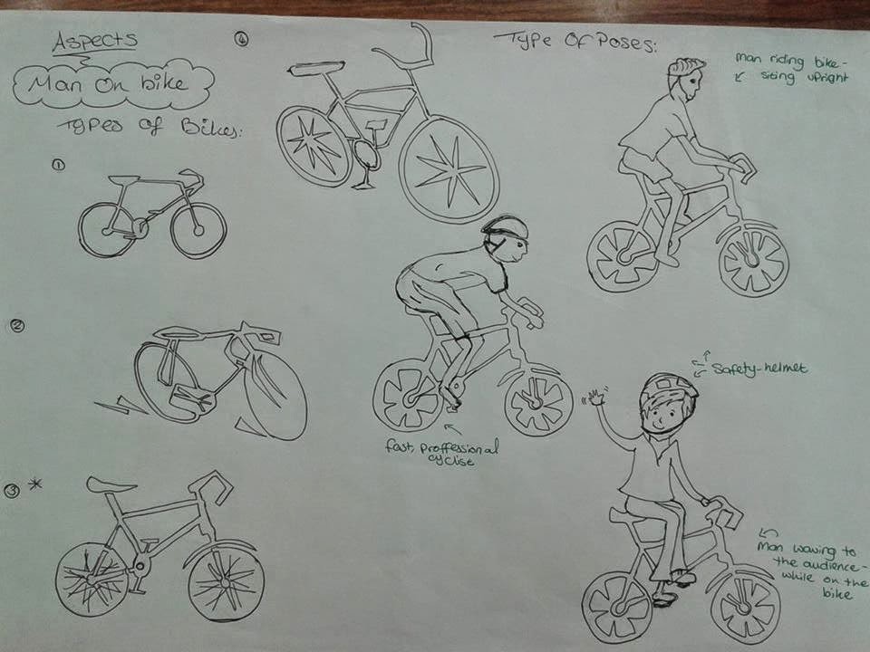
I created a man on a bike to move on the first slide - showing a visual animated image. I looked at and sketched out different styles of bikes, then went on to design the person on the bike. I chose the third bike style and third man design, as he is waving - making it look and become interactive with the audience, and the bike looks mostly realistic.

I then decided on all the different type styles that I wanted for my final motion graphics video. I did enjoy creating this layout as I was able to create my own and include them in my final video.

I created a short story board, adding the type styles in rough and what would roughly happen in the video.


I created a layout showing the images that I am going to use, and stating why and what they are. I used images from group research as well as my own images.


This was my final layout, showing the type styles in full and what the puzzle pieces would look like.

Out of these two ideas, I chose the first design to take even further, to make my final outcome.
I looked at the different logos and the famous places around Dunstable. I found this helpful when deciding what images to include in my final video.
I created a man on a bike to move on the first slide - showing a visual animated image. I looked at and sketched out different styles of bikes, then went on to design the person on the bike. I chose the third bike style and third man design, as he is waving - making it look and become interactive with the audience, and the bike looks mostly realistic.
I experimented with type. I took different type styles from Adobe, and drew them out freehand.
I created a short story board, adding the type styles in rough and what would roughly happen in the video.
Then I started to create my final layouts, including every Detail that I needed to know, in order to create my final outcome.
I was ready to draw out my final designs and scanned them in, making sure they were correct.
Wednesday 2 April 2014
Library Dunstable Research
I looked in a couple of books - giving me information on the hisory of the town and important happenings in Dunstable, showing a few images aswell.
I took two images of the Dunstable Community Centre in Dunstable, as this hold quite a lot of history.


I took two images of the Dunstable Community Centre in Dunstable, as this hold quite a lot of history.
I found a book, edited by Pat Lovering, named Dunstable Decade. I found this book pretty useful, showing me large images of what the town used to look like, with the popular features, such as the Quadrant, famous pubs and the town centre.
This was the second book that I looked in, Dunstable Its History and Surroundings, by Worthington G.Smith - again showing me large images from the history of the town, with a wide range of information.
Subscribe to:
Posts (Atom)