Wednesday 29 January 2014

Research - The Water Cycle

­­­Research – Water Cycle

The water cycle for kids:

1.     Condensation - the opposite of evaporation. Condensation occurs when a gas is changed into a liquid.
2.    Infiltration - Infiltration is an important process where rainwater soaks into the ground, through the soil and underlying rock layers.
3.    Runoff - Much of the water that returns to Earth as precipitation runs off the surface of the land, and flows down hill into streams, rivers, ponds and lakes.
4.    Evaporation - the process where a liquid, in this case water, changes from its liquid state to a gaseous state.
5.    Precipitation - When the temperature and atmospheric pressure are right, the small droplets of water in clouds form larger droplets and precipitation occurs. The raindrops fall to Earth. 
6.    Transpiration - As plants absorb water from the soil, the water moves from the roots through the stems to the leaves. Once the water reaches the leaves, some of it evaporates from the leaves, adding to the amount of water vapor in the air. This process of evaporation through plant leaves is called transpiration.
Evaporation, Convention, Condensation, Wind, Falling Rain (Runoff), Water in sea


(ttp://www.buzzle.com/articles/water-cycle-for-kids.html)
Stage 1) Evaporation – sun evaporates the water, oceans, seas lakes, ponds and rivers. The water is a liquid, however changes due to weather ad heating – the sun converts it into a gas. These vapors of water rise up. Transpiration, water escaping from plants due to the suns heat, also contributes to some extent, to the process of evaporation.
Stage 2) Condensation – cloud formation occurs, the water vapors rise and cool down at a certain height and condenses to form clouds.
Stage 3) Precipitation – water carries on condensing to form clouds, but when there is too much accumulation (collection of water in clouds, they become heavy. this means the air can no longer hold this much amount of water, so the water starts to fall back, mostly in the form of rain, or snow.
Stage 4) Collection – the water in the form of rain or snow gets collected in different water bodies. When it falls on the ground, it gets stored underground – groundwater – Runoff. Again evaporation starts due to the suns heat and the cycle starts again.
Image from my visit to Dunstable Library.


Children's Characters

I researched four popular children's characters, loved by children today. I looked at CBeebies, a children's TV show, and picked out a few characters that I used to watch and that others who I know still watch them. I found the information on the characters at wiki.co.uk.

Thomas The Tank Engine
This is a small, fictional steam animation, taken from 'The railway series' books by Reverend Wilbert Awdry and his son, Christopher. He accompanied the TV spin-off series, Thomas and Friends. Because the fictional characters on the TV series links to the books, the children would learn to read easier and more effectively. This would help as the eco farm could produce fun, learning books for the children to take away with them, which would help them with their reading. Therefore, my character would be easy to recognise if included in these books, which would help the children to remember and memorise the information more effectively and quickly.
Thomas The Tank Engine could influence my character's design as it helps with the children's reading, which would help them better in school and at home. The trains' on the programme are easy to recognise, sketch or create, therefore the children would more likely interact with them. I could use this in my character's design by creating it out of a recyclable material which is easy to find, therefore the children could create their own version at home, creating a memory trigger in their brain when they go over the information that they've learned from the Eco Farm.


Tommy Zoom
Tommy Zoom is an animated TV series, shown in the UK on CBeebies, now all over the world. Each episode begins with tommy's Dog (Daniel), when Tommy is faced with dilemma. Daniel proposes the question 'What should Tommy do? What would Tommy Zoom do?'. Polluto, the baddie, gives Tommy a challenge to face. Tommy will face these challenges in a 'Zoom'. He is seen making the right choices what ever the problem he has to make right.
I feel that the animation is helpful to children as they can learn that by making the right choices, they can overcome anything. However, Tommy never makes mistakes therefore the children could think that any choice they make is the correct one. This could show in the ways that the children act towards others, stealing others toys etc. I feel that the character can be inspirational to other children, as the bad guy in the animation never wins.
Tommy Zoom could influence my character's design as it teaches children that if you make the right choices, you will always succeed. Therefore they are also learning a life skill as well as the water cycle.


Charlie and Lola
I loved this programme as the characters were sketches, making them look fun. They are fictional children created by the English writer and illustrator Lauren Child in 2000. They were first introduced in a series of picture books, and later become animated TV characters. Lola is an energetic, imaginative little girl and Charlie is a patient, kind older brother who is always willing to help Lola learn and grow up. This storyline is well created, as the children watching this are exactly like the character Lola, messing around and doing fun stuff, keeping themselves entertained, and then losing interest quickly.
Charlie and Lola could influence my character's design as they are illustrated like a sketch, a drawing, how younger children draw people on paper. The black outlines make the characters easier to see. I love how the different textures, materials and patterns are shown on the illustrations by the use of colour pencil or pen, then scanned into the computer to create the effect, which again relates to children's drawings. These illustrations really inspire me to create a funky character, who's features are oddly placed and drawn, making them fit in with the messy, mad world of the younger audience. For example, the eyes could be created out of different sized, coloured and type buttons, attached with different coloured string, both a different thickness and length. It makes the characters more quirky, and seem fun and child-like, gaining the children's attention and keeping it, as I know that their concentration is pretty short.


Octonauts
I didn't watch this as it wasn't out when I was younger. However, my younger sisters used to watch this and loved it. It is a British TV series, produced by Silvergate Media for CBeebies. It is based on the American-Canadian children's books written by Vicki Wong and Michael C. Murphy of Meomi Design Inc. The Octonauts are a crew of eight animal adventurers, who live in an underwater base, the Octopod. They go on undersea adventures with the help of a few aquatic vehicles. These characters can inspire the younger children to become more helpful, and even swim better in lessons, if they feel it will be good for them and others, in the future. The characters also teach the children about the risks when swimming as well, which is good for the kids in the future, and it's memorable.
The octonauts can influence my character's design as they can teach the children easy tips about the eco farm/the water cycle, by doing a small activity, a bit like the Octonauts helping out the sea creatures. They also connect to the theme of water, therefore I could create an underwater themed character, teaching the children about the water cycle, and eventually other underwater animals and life.

Monday 20 January 2014

Secondary Research

I researched the Eden Project, looking at their own website First. The Eden project is a charity and social enterprise as well as offering days out for fun. Based in Cornwall, the enterprise works on many different matters. Some of these include: People and learning, Places and generation, Climate and environment, Plants and gardens, and Music and art. A lot of the energy produced in the Project goes towards many different areas. These are:

  • Running transformational, social and environmental projects in Cornwall and around the world. 
  • creating unforgettable learning experiences for students.
  • Doing valuable research into plants and conservation.
  • Making sure they run their operations in the greenest way possible. 
Being a social enterprise means that they reinvest their profits into the charity's educational projects. 

The history of the Eden Project:
In March 2000, the project was at last fully funded. Vital grants, loads and sponsorship arrangements meant that they now had the 50% match funding needed to secure the generous millennium Commission grant promised back in 1997. Finance Director Gay Coley, now MD, signed a contract with NatWest's Dennis Spencer. 
In March 2001, Eden officially opened on the 17th.  
In January 2004, Eden started an international programme helping school children create gardens, where they can look at food, environment and citizenship issues. 
In June 2006, the Queen visited Eden. She said: 'I am confident that the Eden Project will continue to encourage a better understanding of the planet on which we live, to offer a vision of hope for the future, and to inspire us all to work to make this world a better place for everyone'. I feel that this is very inspirational to the workers at Eden and to the people of all ages who visit. I feel that by generating a certain slogan or sentence that my character could say would stick with the children and encourage them even further. It would have to be quirky and fun to attract the younger audience.

What is an Eco Farm?
I looked at a website called http://www.eco-farm.org/ which told me the definition of what an eco farm is.
'The Ecological Farming Association nurtures healthy and just farms, food systems, communities and environment by bringing people together for education, alliance building and advocacy.'

Eco Farms and Advertising Campaigns:
I also researched different eco farms around the UK, gaining knowledge and a better understanding of the client's surroundings and what my brief includes.
I looked at a place called BeechenHill Farm, looking at their website to gain research. The organic farm is situated on the south facing hill above the picturesque village in Ilam, on the Staffordshire, Derbyshire border in the Peak District National Park. There mission is 'To please you, so that you return, in a way that pleases the planet and pleases us too'. There is also a place to stay, making it easier for the visitors to see what organic projects the farm work on.
Seeing as I am focusing my brief on the younger audience, I looked at the 'BeechenHill For Children' page. This showed me what activities the children could get up to while at the farm. They were very energetic activities, easy to understand and play, making it fun and enjoyable for the kids, as well as learning a lot. Some of these include:
  • Making a grass trumpet,
  • Watch the milking,
  • Rope swinging,
  • Building a den and
  • doing a night time nature walk.
All these are fun for the children to enjoy and they are learning, which is one of the main matters of this farm. By watching the milking, the kids are intrigued into a different culture, and watching it can be more effective and interesting for them. I love the idea of having fun activities for the children to do as it captures their attention, they are learning and it is a new experience for them. 
This is a map for the children and the families, giving them a little understanding about the farm and the layout. The writing is funky, however I feel that simple works best as this is how they learn to write. Therefore, they might get confused and lose concentration. The different shades of green help the children to understand what areas they are visiting.

There are a five areas that the farm covers. These are Dairy Farming, Sheep Farming, Field Work, Sustainability and Organics. These are good topics for the children to learn about, as the can do various activities to make the learning more effective. The colours are bright and the cartoon images are very recognisable, which stand out more to the children. However, the big words used will need the adults co-operation as the younger children may not understand and therefore their learning wont be as effective. 
I also looked at Urban Farm and their website. It looks very fun and definitely catches the younger audience. Based in London, the eco farm inspires children to be 'passionate and responsible conservationists'. This has always been their goal, as well as getting the next generation to fall in love with nature. I looked at this website as it concentrates on inspiring the younger children, which is what I am focusing on. On the website, they stated 'demonstrate engaging children in an exciting and interactive way, as we do, produces a passion and understanding beyond what any text book can produce'. This shows that by doing the actions themselves, the children understand and memorise the information easier. I can incorporate this when I think about what activities they can do, and what information they can learn that will be effective in the amount of time that they complete the activity.
This image is the character that was designed for Urban Farm. It is pretty bright, however the facial expression doesn't really look warm and welcoming even though it is smiling. The type is fun, and is co-ordinated with the colour of the horse/donkey. Me and a few others couldn't work out exactly what the image of the animal was, therefore this could put the parents and some of the children off from visiting the farm. I am not very attracted to this design as it doesn't look very creative and doesn't create a smiley welcome. 

I also researched Ecoweek.org.uk. This is an organisation in mid-Wales and/or Hagg farm in the Peak district. They are a non-profit making organisation, who run residential holidays for children. Children enjoy 7 days of activities learning how to save the planet, playing games and a lot more. Some of the activities include:
  • Walks in the hills
  • Swimming in Machynlleth
  • Making and testing wind turbines
  • Exploring the woods blindfolded
These activities would excite the children, get their blood pumping, working, learning and having fun at the same time. One of my main aims of the character design for the children's' area is so that they learn and take in most of the information that they are shown. 21% of the information told to a child actually stays in their memory, therefore by creating a way where they do various activities to learn about the topics, they memorise at least 82%.  

These are the 2 logos that were designed for the organisation:
I love the first design as it is funky, shows interest and shows the audience what they are trying to achieve. The younger audience would be more enthusiastic and excited if they saw this design as it interacts with the children and the environment.  
 This design is very simple, however by using 2 various tones of the same colour, it looks more professional and gains the adults interest more than the younger audience. The weight of the type is very simple but it stands out to the crowd. 

The last farm I looked at is Mead Open Farm, as this is a very well-known place for children to come and play/learn with the animals. They offer time with animals, feeding them and learning about what they are etc, and a play area. I looked at the activities that they offer the children. Some that stand out to me are 'Giant's Rock' and 'Outdoor Log Play', as they are very outdoorsy, interactive games, so the children could learn about rocks and volcanoes, and how trees are grown etc. This could be a very effective method for the children to learn quickly as well as having fun. 
The map/advertising campaign leaflet is aimed at children as the images and colour text boxes will make them interested. By including various amounts of body copy, using a smaller point size and bigger words, adults are also interested to find out about the farm. The layout doesn't look very professional, as this would be too boring to the younger audience. Therefore, by designing a colourful, jam-packed leaflet, it looks fun for the children. The type used it very simple, in black so it is easy to read on the coloured background. The cartoon-like illustration of the farm makes it look fun and interactive with the children. It is also easy to understand and follow, which is needed if I am to aim my character and poster the younger generation. 

The logo/character design is of a shaggy cow, looking pretty happy about itself. The black outline makes the illustration look simple, therefore easy to create on various objects such as gift bags, marbles or billboards. The type used is funky and stands out from the green, white and purple circular background. The design is pretty simple, however it stands out to the target market. 


Mascots
I looked at famous mascots aimed mostly at the younger audience, as this is who I am aiming my character at. Firstly, I looked at McDonalds, as most children are attracted to fast food and fun toys etc. The mascot is a yellow-orange and red clown. I dislike the clown figure as I don't like clowns and the face looks pretty freaky, however to younger children clowns are meant to be funny, clumsy characters. Therefore, this would appeal to the children, showing them a fun place to eat. 

Next, I looked at Kelloggs, as the tiger comes across as smiley, healthy and fun. Therefore, this would encourage the children to eat kelloggs and eat healthily. Looking at the tiger, the arms are open, suggesting an open welcome, welcoming the children in with a huge smile on his face. To incorporate this idea in my own 3D character, I could make sure that they are welcoming, show kindness in the expressions that they hold and make them fun.

M&M's are a brand for everyone, and by creating 5 colourful cartoon versions of the chocolates, makes them look fun to eat. The facial expressions and the way that they hold themselves makes them look fun and quirky, making the children interested in them. Giving the characters human features gets the children's interests, making them look different and funny.

Pudsey Bear is a very well known character for Children In Need. The colours used are very simple, and the thick, black outline creates a bold finish. By using yellow as the main colour, it creates a warm welcome for the children as it is a happy colour, as well as the expression on the bear's face. By giving my 3D character a black or coloured outline, it makes it stand out and looks bold, enticing the target audience to find out what it's all about. 

Children's Programmes 
I also looked at famous children TV shows and characters, such as 'Bill and Ben' and The Tin Man from The Wizard Of Oz. Bill and Ben were made from plant pots. Even though they are not recyclable materials, it connects with the eco farm theme. 

 The tin man is made from the recyclable material, tin. By creating a human character created out of tin, this effectively grabs the children's attention, as it is unique and strange. By adding oil to the Tin Man, this stops the squeaky noises, therefore to create interaction between the children and the farm character, the children would have to add water to the flower in order to make it grow, and learn quicker, for example. 


Wednesday 15 January 2014

Extra Spread

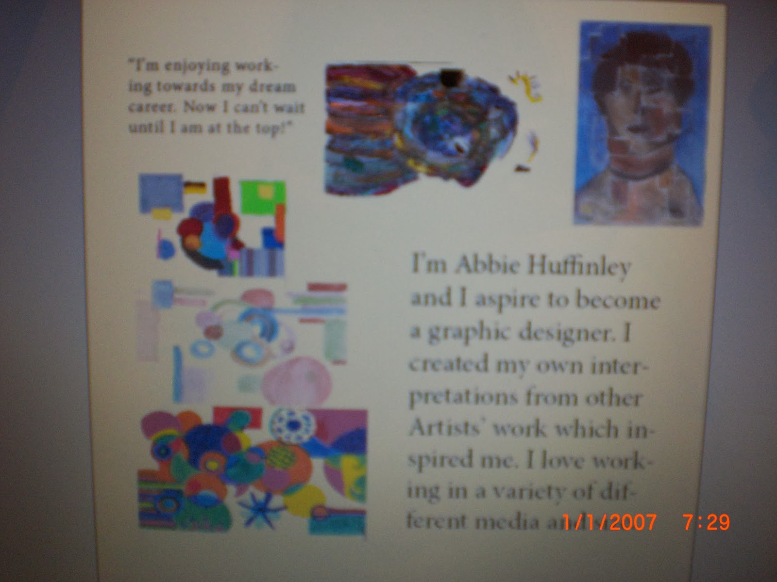
I designed layouts to create a single page spread, including my own work inspired from artists that I had researched and a little body copy on myself becoming a graphic designer. I looked at the layout, the images I would be using, the text style and what my body copy includes. 

I then designed my final idea in Adobe InDesign, on a single page spread. I included 5 images, all pieces of work that I have created, influenced by three different artists.

 This is the overview of the final one page spread, showing my own work and information on what I am trying to show, about me and wanting to become a graphic designer.
 
Close ups of the text that I included in the spread. I included a quote in the corner, giving my own opinion on working towards my goal. This also acts as a small heading, inviting the readers in and giving them an idea on what the spread is about.
 My own body copy - explaining who I am, and what I want to achieve in the future and what I have included in this spread.
Close ups of the images of my work that I have included. In the image below, I showed the three pieces of work that I created, inspired by
 This is the 3D work that was inspired by
 This work was inspired by

(Note: The dates on the images is incorrect, the battery on my camera set itself up to 2007.)

Evaluation
I am pretty happy with the final design of the spread as the layout looks fun and the body copy is easy to read and understand. The sizes of the images all work well with the amount of text that I have included, and they flow, making the spread easy to follow. I kept within the margins, making the layout look simple and easy to follow. If I was to repeat this design, I would definitely think about placing the body copy somewhere else around the images or a would change the point size as there was a few hyphenated words. Therefore the text would look more professional. I am also happy with the pieces of work that I have included, my favourite piece is the 3D artwork,  as it stands out and I found it interesting when using the pastels as a medium. I used two columns when typing my body copy as it would be easy to read and what attract the readers along with the images. 

Poster and Front Cover Final


This is an image of the final design for the V and A poster, that I created in Adobe Illustrator. I
I am very happy with my final outcome as the colourful repeated text stands out so much against the black background. The layout of the text boxes are all parallel, which shows that I have used the grid system carefully and appropriately. I have broken some of the type rules by overlapping the text boxes and changing the point sizes. I think that by using reverse type for the important information and the logo on the poster makes it stand out against the black negative space and the colourful typography design. The simple strips of black going across the bottom and diagonally in the top right corner make the poster look more effective as it keeps it simple and makes the reverse type easier to read. The typography design and the black negative space bleeds of the spread making it flow onto the next page and creating an effective advertisement by making a statement.

If I was to repeat this design on the same software, I would increase the point size on various text boxes in my typography design in the background as it would be easier to read from further away or on a bigger scale. I feel that if I didn't overlap the type as much as I did at the top of the page then it would be easier to read and understand, which would look more effective to the public eye and they would therefore be more intrigued as to what I am trying to show them. I feel happy with the type style that I used, however if I was to use a funky style this may intrigue a lot more people and in a more effective way. The style that I have used on the design is very simple, however the bold, 80's style colours that i have used for the type would bring people in as it is pretty effective.

The bright colours relate back to the 1980's style. I placed the type design against the black background as it looks more powerful and effective rather than the white background. It also relates to the 80's style more than the white background. I love how the colours flow across the spread, weaving in and out of the different colours. I think that the poster would look a little more effective if I increased the amount of information for the exhibition in the black area as there is not much there to read, making it seem pointless to the viewers.


This is the final design for the front cover of my 80's themed magazine. I named it AKA Design as it is short and simple. I feel that the colours used are bold, however I feel that they are not very 80's themed as they are not as bright and powerful to the reader as they could have been. The reverse type on the title makes it stand out. Even though I have used popular colours, such as red, white and red, I feel that they stand out better, making the viewers aware of the magazine on offer. If I was to do this again, I would chose brighter bolder colours that relate more to the 80's style, which would make the magazine cover more appealing and funky. 

I included two short articles either side of the magazine, including visual images to catch the viewer's attention. I positioned the 80'S ROCK!! article as aligned on the right hand side as the smaller rock images looked neat and because this also makes the images in the centre stand out. I overlapped some of the images and bled an image off the page so it looks more graphical and would appeal more to graphic designers to gain inspiration. I kerned the characters together in the title, as it looks more effective and so it fits better on the page. I am really happy with the layout, title. images and body copy that is included in the final outcome as it stands out. I added the issue number, date and the price in the top left hand corner.

If I was to repeat this design I would definitely add more bright colours as it would look more 80's, making the viewers more attracted to the magazine. I kept the negative space white as I didn't want to over exaggerate the cover as this could put some people off. I feel that I included enough text in the short articles with the point size that I used as it looks bold, making it look interesting for the viewers to read. 

New Brief - Eco Farm - Innovative Character Design

For my next brief, I am working with a live client, developing my skills, working on idea generation, expanding my creative mind and working with different types of media.
The Eco Farm would be created out of recycled goods, as it just starting up, it needs a lot of design work to build it up. The owner would like to include a children's play area, and they feel that a quirky character created from recycled goods would attract the younger audience and would create a fun environment for the children to learn in. 
I will be visiting the Eco Farm and looking at what the owner is trying to achieve and how I can work with them. I will gain inspiration from the farm itself, the surroundings, the owner's house, leaflets that I will collect and any other research that I will perform. I will also design my own 3D character, created out of recycled materials, aimed at the younger audience. I will design a poster showing how water is recycled, using my character to help teach and show the children. I can show how water is recycled in any way, as long as it makes sense and easy to understand to the younger audience. 

Thursday 2 January 2014

Double page spread Final

I created the double page spread in Adobe InDesign. I took the images on a camera on my laptop as I cannot convert the format. I am very happy with the final design as it is easy to read and look at. 


Evaluation
I feel really happy with my double page spread as I feel that I grasped the 80's theme and the structure of a magazine well. However, I do think that the 80's theme hasn't came across strongly as I would have hoped, therefore if I was to do this again, I would definitely add more stronger, bolder, brighter colours to make it stand out more, which would look more interesting and effective towards the readers. I am happy with the body copy as the structure is simple and easy to read. I added the main body copy on the left hand spread as this side is known to be used for editorial content. The copy will then flow towards the images on the right hand spread, to the logo and the caption. I inserted the three main images and the logo on the right hand spread, as this is the more exposed area when readers flick or look at the magazine, also because it is the heavier side. The images bleeding of the page will also gain the most attraction, making them visible when people flick through the magazine. When looking at other graphics magazines, I noticed that they are well simply structured, therefore I inserted an image, with the body copy wrapped around it on the bottom. I am pretty happy with the design of the heading as I used bold colours, linking with the 80's theme and looking effective towards the reader. However, I feel that they are not that effective against the white space, therefore if I was to repeat this, I would change the colour of the background to a darker shade or colour, such as back, then reverse type the body copy making that stand out even further, although I don't want to over exaggerate my double page spread.  


Layouts

I created layouts when I deigned my V and A poster, double page spread and the extra single page spread. These are the final designs for all of the above. I looked at the images I would use, the layout of the spreads, the text style I would use for the body copy, headings and subheadings and positions for the headings, images and body copy. 
I printed off different sizes of the VandA logo, which I could use when designing the layouts.

I looked at different type styles on Adobe Illustrator , looking at what they look like on paper and looking at the size that I could use. 
My poster layouts:


 The final design
 Double - page spread layouts:


The final Design: