Thursday 24 October 2013

Name Generation

The client wanted a new name for the refectory, something that was catchy, quirky and funky. We had a group discussion over names, however there wasn't much of a great choice. I went away and created a mind map of any name that I came up with. 

This is the mind map that I created for my own name generation. I really like AnimalPrint or FootPrint as it states that the students can leave their own mark in the refectory and show their personality. 

We looked at the opening hours for the refectory and used them to create a name. This was put across to the client and they really liked it. Therefore, I will use this and develop it further. I also like the name as it is different and does not use simple, consistent names such as 'The Lounge' or 'The Hotspot'.  The final name that I have chosen is '8 To 3'. I experimented on the middle word as it could have been shown across in different ways, such as 'To', 'Till' or '2'. 

Strap Line Generation

I then created a few strap line ideas to go with the name. These include:

  • 'Chillax and eat, Meet and greet'
  • 'Snacks, Salads and memorable moments'
  • 'Enjoy Life at the 8 To 3'
  • 'Breakfast, Brunch, Lunch'
  • 'Feed your machine, Refresh your mind'
  • 'Jump into a pool of relaxation'.
My favourite strap lines are the 4th, 5th and 6th. The 4th strap line is fast, quick and fun to say. The 3 B's make a fun alliteration, which makes it very catchy. The 5th strap line is very clever as the machine acts as your body, which needs food and liquid, which is available at the refectory. Students go to there to relax. refresh and chat with friends, therefore the last part of this strap line shows this. The last strap line is memorable, however it is very calm and sophisticated, which may not suit the students' personality. The client loved the 4th strap line, as it is quirky, therefore I have chosen to use this. 

Friday 18 October 2013

Secondary Research 2

I conducted secondary research, using three different company's and websites.

The first company I looked at was Starbucks. Their website is structured, however it is quite plain, therefore it would attract older customers. They have used various neutral colours, which can suggest a lounge-around feel. I looked at www.yelp.co.uk which showed me different reviews from a couple of people. The dining area was situated in Slough. The first review I looked at gave Starbucks a 5 star rating. They said 'It was a chilled, relaxed atmosphere, with smiles all round. The staff are very polite and the chairs were comforting'.  Review two gave a 3 star rating, saying ' As well as serving coffees and a variety of drinks, they serve lunch time food. Inside is very cosy and the theme is art softening'. The next review is from Harrow. They gave a 4 star rating, saying that the seating area is very spacious and the menus are easy to read'.

I used a website called gourmet-coffee-zone.com/starbucks-logo.html to find out what the Starbucks logo means. The logo has achieved broad, visual recognition, equal to familiarity to the brand name itself. The image is of a certain mystique that surrounds the trademark. The mythical two-tailed mermaid, named Siren. The Siren was take from Greek mythology and was an alluring, irresistible female figure, typically half fish/half women. The Siren's objective was to seduce the seagoing mariner with a powerful, enticing song most often to the unfortunate demise of the susceptible sailor who could not resist temptation. The rings around the mermaid and the brown colour scheme was designed to resemble a cigar band label.

I looked at the company's website to research the history, looking at the page 'About Us'. The first Starbucks opened in  1971, and was a single store Seattle's historic pike place market. The name, inspired by Moby Dick, evoked the romance of the high seas and sea faring tradition of the early coffee traders. Howard travelled to Italy and became captivated with the Italian coffee bars and the romance of the coffee experience. He had a vision to bring the Italian coffee house back to the United States. It is a place for conversation and sense of community. It is known as a third house, between work and home. It celebrated coffee and rich tradition but also bought a feeling of connection. They have more than 15,000 stores in 50 countries.  The menus are structured as it flows really well. They have used the same text type all the way through, which creates a clear view. They are simple, easy to understand and bold, however they are not very eye catching.

Starbucks Mission Statement:
'To inspire and nurture the human spirit, one person, one cup and one neighbourhood at a time'.


Next, I looked at KFC. The website was quite short, however it was well structured and simple. I looked at the 'About Us' page on their website when researching the history of the fast food restaurant. The founder, Harland Sanders was born on September 9th, 1890 in Henryville, Indiana. Around 1920 to 1929, Harland lived a life of country song - working his way around the southern states. In 1930,  Harland (now 40) bought a roadside motel and cafe in Corbin, Kentucky, and opened KFC. In 1965. Southern style chicken came to the north of England - Preston. They refreshed the logo design in November 2006 and right now. they have 800 UK restaurants.

The logo design information I researched on www.dineish.com. Colonel Harland has always been part of the logo; overtime his face became more friendly, as it was serious before hand. The red in the logo gives it a more bold, lively look. They renewed the logo again in April 2007, where the colonel shed his white suit jacket for a red apron. The logo includes bolder, brighter colours, more well defined visual image, and kept the famous black tie, glasses and goatee. The smiling colonel is featured against a red background, which matches his red apron, and with the KFC  brand name in thick, black lettering under his chin.


I also looked at a theme park to research the colours and designs as this is also aimed at the same audience as the refectory. I chose Thorpe Park as they are very popular. The website is very funky, and includes a different variety of text types. It uses bright, bold colours to pull the audience in. The logo is very self explanatory, catches attention, vibrant and used blue and orange which bounce of each other because they are complementary colours.


Artist Research

Kate Moross: I looked at her website to find out about what and how she designs. Moross is a 26 year old London based creative designer. She is the director of Studio Moross, has a fascination with 3 sided shapes, illegible typography and free form lettering. Moross studied at South Hampstead High School for primary and secondary school. She studied an art foundation at Wimbledon school of art, and went on the complete her BA degree at Camberwell school of art in 2008. Her achievements include billboard campaign for Cadbury's, a signature clothing rage for Topshop and illustrations for Vogue magazine. She regularly speaks at art conferences and has sat on the jury for the D&D Awards in 2012.  From Wikipedia

I love this line illustration as it is so simple against the powerful coloured background, so it stands out because of the lighter line drawing. The simplicity of the design creates a funky, relaxed mood, which is what I want to incorporate when I re-brand the refectory. By adding more detail to the darker areas of the face, I am able to recognize what is being put across on the album cover. The colours definitely pull me in as they are calm and cool, creating a fun but relaxed mood. 

 In this design, she has used bright, bold colours making the mood very fun and bouncy. When I look as this design, I feel that the circular shapes definitely relate to the main point of the design - The discovery project. By looking through the middle of the circles, you are discovering what is there, therefore discovering what you can do with your life. The bold colours make me think of a bright future, and the circles tell me that you will never be forgotten or lost as the circle of life never stops. they keep going and never breaks. However, I also see the circles as a negative point as they never end, therefore it would be hard to remove yourself from a tricky situation as it would just keep going round and round in your life, our mind and the circle. The way the circles interlock create a good sense of safely and partnership in our lives, therefore creating a good state of mind when I look at this design. By using bold, bright colours in my designs, this would also create a happier, funky vibe in the refectory.

 This design is very clever as you can easily see what the designer is trying to show and what the packaging is selling. By using the different, bright colours the mood is very calm, making me think of the beach and ice-cream, therefore the summer time. There is also a lot of white space, which also creates a calmer mood when looking at this design.


DesignJuices.co.uk: I found a couple of designers on the website. 
Sonya Parra: Based in Leicester. but often working in London. her work is inspired from fashion, art, illustration and concept art. Parra had said 'My style is often described as feminine, pretty, sexy or edgy, depending on the piece with colour and lighting fascinating me the most. I try to create mood and love the human form'/If I was to use Parra as inspiration, I would take note of the illustrations and the way that she creates them, and keep away from the feminine side as the refectory is used by both genders. Her favourite media for drawing are ink, charcoal, non waterproof fine liner, marker pens, layout paper and textured water colour paper. I could use one of these methods when creating an experimentation piece. 

I love this illustration as it comes across happy and lively as the colours are very relaxing. I am ultimately pulled into the bright lights and colours in the middle make me think of happy times and smiles, however when I look out and around the page, I think of dark secrets linking to the darker colours. The flowers around the left hand side and the bottom create a girly feel, reminding me of secret gardens. The different types of flowers make me think of the different moods that you can through, so i could relate this in my work to show what different things happens in college. 

 This illustration is again very girly, which is easily shown through the colours and imagery. I love how the background is blurred, creating all the focus on the girl and her shopping which is what most girls liker to do best. The girl looks very indecisive, which can be shown by the many  pairs of shoes at her feet. I could incorporate this in my designs as it can be hard to choose what to eat from the refectory.

 This image looks a lot more dark, creating a creepy vibe. To liven this up, I would had bright, bold colours splashed onto the image in various places. This would make a funky design, pulling teenagers in to a more quirky atmosphere. However, when noticing the line drawings in the black areas, I am pulled into the image even further. It looks very clever as it follows around the face - white space.

Luka Molnar: she is a graphic designer and illustrator from Hungary. She has worked as an illustrator since 2006, with her works being featured in magazines all over the world, for all different companies. Molnar's work is very simple yet complex, mixing geometric shapes with neon colours, making it seen funky and relevant. She uses inspiration from lyrics to fashion magazines, making her work unique and detailed. 

This typography design is very funky and suites my target audience very well. By going against some of the type rules it pulls teenagers in as those years are seen as breaking the rules, making the most of what you have got and live your life. 

 I love this design as it is so simple, yet effective. The idea of the shapes all broken up pull the teenage audience in as they don't fit together, making the idea of being perfect destroyed, When I look at this design, the broken pieces show me that no one is perfect yet you can still create a picture, therefore building up a structure to your life. The image of a lion shows me to never be afraid of what will happen, take it as it comes.  The colours used are very cool and show me the feeling of trying harder rather than feeling down or upset The darker areas show me that there will be hard times, but that you will get through it.

 This design is very bright and happy, which is what I want to immediately show in my designs for the refectory. The yellow glow in the middle against the lime green background shows me that there is fun ahead of you when you drink sprite, therefore creating a sense of belief when the viewer sees this poster and buys the drink. I hope to do the same thing with the colours and imagery that I use when I re-brand the refectory.


Corporate Identity

Earlier on in the week, we were given a discussion about corporate identity by Dawn and Malcolm (My tutors).  Corporate identity is a form of communication between the company and the customers. It is the personality of the company and how they show that across. Overall it is communication that personifies the personality and the character of a brand. This is so that the customers know what to expect and if they approve of it. It is also for the people that work there, to be able to be proud of the company they are working for, which would show in the the quality of their work. When thinking of the personality of the company, there are a range of aspects to include/think about. These include:

  • The Logo - the top three brand logos are Apple, Google and Coca-Cola. In general, they shouldn't be too fussy or overpowering. It should be simple, memorable and easily transferable for different uses, such as cups or napkins.
  • The Colour - attracts the customers, depending on the target audience, and it sets the mood.
  • Uniform - that the workers wear, and what perception it puts across to the audience. 
  • Furniture - gives the restaurant/cafe a theme.
  • Strap lines - creates a catchy, memorable method to recognise and remember the brand.
  • Sign-age - first impressions of the brand towards the customer.
  • Buildings - makes the restaurant's appearance look inviting.
  • Visual materials - could include the type face and brochures . What looks good for the customer and what works well for the brand.
  • Employees - Friendly and welcoming to make the customers feel happy and relaxing in the company's environment.
  • Music - creates an atmosphere, and invites a younger audience.
  • Website - gives the audience knowledge on the company, should invite the audience and pull them in.
  • Product - The outcome that the customer receives, should be of a high standard, which could increase repeat purchase. 

Case Study
We looked at BP and how they showed corporate identity. Their old logo was old fashioned and didn't catch much attention. The 'British' element also didn't go down to well. They evolved the logo by changing the lettering to Italic, and places the type onto a green slab. Apparently it took ages to find the correct green, as the logo will be on everything that they create. The website is very plain, so it would attract the older generation/audience. Although, they have kept with the present day, adding Facebook and Twitter links to their website. The text type is the same all the way through, which creates a better view on the website and everything that they produce. 

An image of the logos that have developed over time.

This image shows that the logo should be able to work on massive objects (including an air balloon) as well as uniform or A4 sheets of paper.  I have to be able to create a logo which can be designed onto stationary or paper cups, as this will advertise the refectory as well. 


Thursday 17 October 2013

Materials

As a group, we had a discussion about the materials that we could use for the designs for the re-branding of the refectory, as long as it stayed within the low budget. We looked at blackboards, and the pens that could be used to write and decorate the blackboard. These two items are very cheap and easy to buy, which would be great for the low budget theme and the client. We need to make sure that the client is able to change the meals or price menus on the materials that we choose to use.  Another idea is with magnetic letters onto a magnetic board. The letters could be quite funky, depending on the design that we choose to develop. The lettering would then work really well with the colours and theme that are already in the refectory. I could give the client some ideas on how to improve the furniture later on in the future. Sticking with the magnetic theme, the client could use magnetic paints onto sheets of magnetic board, however this could be quite costly and will use up a lot of resources. Seeing as we have to stick with the September font, that Central Beds College use, I could create a stencil sheet with all the letters, numbers and symbols onto a plastic sheet or perspex. This would be a little time consuming when creating the plastic stencil, however the type writing would be simple. Again, we could use a blackboard and pens to place the type onto. This would look effective and create a lounge feel. However the colour theme would have to be cooler to create a sense of relaxation. If we stick with the bright, bold warm colours, we could adapt the blackboard into a funky, colourful menu board and price list. I could use the paving slabs outside, leading into the building where the refectory is placed as an extra advertising area. I could use specific thick chalks that are cheap to buy and easy to use. The wide paving area means that a variety  of colours could be used and images could be created and illustrated onto the slabs. When looking at the Subway Arrow in my earlier research, it points directly above the door to persuade the customer to come in, and the fact that their food is the only way to go. I could use the new name of the refectory, and include various arrows to guide and persuade the students towards the refectory. I have to make sure that I am aware of the brightness of the red colours on the walls and the beams, as this could become quite overpowering and intimidating for the students and adults. I could collect the menus and price lists from the client, and create a word document with the information on and add images to make it look creative. Then enlarge it and add plastic over it to protect it. This way, if the client wants to change the information on the board, then she could tell me the info, and I am able to change it on the word document that I saved from earlier on. This would be simple, effective and creates a chain reaction. 

Secondary Research


I conducted secondary research, using two websites on the internet. The following nine businesses and brands are taken from www.superdream.co.uk/best-advertising-slogans/.  I focused on the strap lines and the colour co-ordination on the logos, and how I could incorporate different aspects into my designs.

I used McDonald's as they are a widely known restaurant/business. The strap line is very catchy, simple, effective and successful. 'I'm lovin' it' ties in really well with the company's brand values, as the food that they produce is fast food and cheap. It sticks in peoples' minds, which creates a psychological effect in their minds. The strap line is coupled with the company's signature advert, bright colours and branding. The famous tune sticks in customers' minds and is easily recognisable, especially towards young children. The style helps to create a winning campaign every time. 

KFC is a fast food restaurant in competition with McDonald's. Their strap line 'Finger lickin' good, is a long standing advert slogan that reflects the company's values. It tells the audience that the chicken tastes good, which should invite the customers' and the target audience in. This is exactly what you want from a fast food restaurant, cheap and cheerful.   


Subway's strap line is very clever as persuades the target market to buy their food. Fast food is notoriously bad for you, so in a bid to position themselves as a more healthy restaurant, 'Eat fresh' was created. This lets the audience know that their sandwiches and fillings and always freshly made and prepared. The strap line is coupled very well with the yellow and green branding, as they are 'fresh' colours. They show the customers a fresh vibe when watching or looking at the advertisements. The arrows could mean that this fast food brand is the only way to go, and I like the fact that they have attached the arrows to the lettering, which makes the whole design flow. 

Tesco is a massive company, therefore it needs to have a logo and strap line that is easily recognisable, effective and simple to catch the customers' attention. The text type for the name of the company is very simple, which makes it easy to read. The funky text type for the strap line underneath creates a quirky edge, and pulls in younger customers as well as the typical target audience. 'Every little helps' is famed for Tesco's low prices and their huge stock list. The strap line perfectly reflects this, as the text is bold and bright against the blue underline. The strap line is regularly used in television and printed marketing, because it is very memorable and effective.  

Heinz logo 'Beanz Meanz Heinz' is very clever, because not only does it mention the brand name in the strap line, it keeps things short and sweet. It plays on the brans name and the product, making the target audience thinking that Heinz is the best brand to buy if they want baked beans. The colours used are very bland and boring, however the white text against the black background pulls me in. Images are useful to the customer so that they know what product to buy, and what brand to look out for next time. I could include images on the logo, part of the text or on posters/menus around the refectory. 

Skittles is a very lively brand, which their strap line 'Taste the rainbow' shows really well. They have used this strap line since 1994, this shows that this is definitely catches peoples' attention. It perfectly reflects the product, as the sweets feature a wide variety of colours-that of a rainbow. Which is why the image of a rainbow is perfect on the logo and the packaging design. Red is used a lot in this design. This could relate to the fact that red is the first colour in a rainbow, therefore skittles is the first brand/sweets to choose and eat before the others. The text is easy to read, and is mainly placed at the end of the rainbow, which can relate to the childhood memory of finding the pot of gold at the end of the rainbow. 

Rice Krispies's strap line is clever as it is also connected with the characters for the advertisements, 'Snap! Crackle! Pop!'.It has been synonymous with Rice Krispies since the 1930's. As well as being some great mascots, the three onomatopoeic gnomes make for a great long lasting slogan. It is said that when the cereal creates a 'snap crackle pop' noise when milk is added, it is hugely effective for the customers, especially the younger children and for Kellogg's. The colours are very cool, creating a calm atmosphere, which is needed in hectic mornings! 

Kit Kat's 'Have a break, have a Kit Kat' is a lunch box favourite for the younger audience. The colours attract their attention, and the logo design is easily recognisable. It is used in printing and TV advertisements, as the tag line reflects how quick and easy the wafer bars are to snap and eat. It is simple and easy to remember, which is much like the company's red and white branding. I would not use a similar colour theme as Kit Kat, as it is very typical and could be quite overpowering if there is too much in the refectory area.


The next few company's are taken from www.ad.mad.com/slogans. 

7UP - 'Freshen up with 7UP'. This is effective as it is easy to say and remember because it rhymes. It is catchy, and the two complementary colours create an inviting logo design. There is not too much going on, larger areas of negative space are shown, which would attract customers more. 

These two are taken from Country Life butter, their strap line is very tongue twisting, however it is quirky and effective. 'You'll never put a better bit of butter on your knife' is  the catchy strap line. The logo is very creative as they used a letter to create an image relating to the name of the product. They have recently developed funky styled characters, which could attract customers to buy this product.


Wednesday 16 October 2013

Colour Theory

When preparing for the design stages for my brief, I had a colour theory lesson. I got given an electronic version of the colour wheel document. I looked at primary, secondary and tertiary colours, situated on a twelve sector colour wheel. I found this fairly easy, as it is basic knowledge, however when looking at the end of lesson test, I got three questions wrong because I got confused on tones, shades and tints. The black line running through the middle of the colour wheel splits the wheel into warm and cool colours. The warm colours would be great if they are used in the designs as they are very bold, vibrant colours. However, they could be too overpowering, therefore I  would need to think of the different shades and tones I use in order to create a comfortable feeling in the refectory. The cool colours create a calmer, more sophisticated atmosphere, therefore the students and adults would feel more mature. The colours used need to create a great vibe in the refectory, inviting the students in and relaxing with their friends etc. 

We were allocated to a partner, and using this pattern, create three different coloured images. In the first image, we used two complementary colours, pure red and green. The red brings a vibrant feel against the darker green, as the two colours stand out from each other. These two colours are often related to Christmas, therefore they may not necessarily work in the refectory, as it might show off a different personality trait to what we were aiming for. My eyes are drawn into the middle, then pulled back out again from the red, however my eyes then follow towards the corners, which brings it all back in a again. A similar design or colour to this pattern may put off students and adults if this was created for a logo or on a menu board.

In the second image, we used two different complementary colours, lighter shades of orange and blue. This makes me think of the beach, the sand and the sea, which could create a calm, relaxed feel towards the students. The pattern is a lot easier to look at, as the tones are not so bold and bright. They bring you in towards the pattern enough to feel relaxed, lazy and day dreamy, which could be incorporated in the design stages for the refectory. This could be good as students would want to relax after working hard beforehand. Beaches are very spacious, relaxing and lively places, which is what I want to reflect in the designs. Because of this, I could take this idea forward and see how it plans out. 

The last image that we had to create was by using analogous colours, These are three colours that are placed with each other on a 12 sector colour wheel. We chose blue-green as the dominant colour, using it as the background colour. For our supporting colour, we used pure green as this is a cool colour, and lastly we added a lighter tint to the blue-green for the accent colour. These three colours create a soft feel on the pattern, making it easy for my eyes to look at. The pure green areas definitely pull me in towards the middle and out again, and some areas look like they are moving. This could work really well for the mood setting and the atmosphere that I want to create, as the tones used are very cool, and pull you in at the same time, therefore pulling you into the refectory. 

I found this work really fun and informative, as I am able to incorporate this in my design development. I could create a funky atmosphere, with crazy, vibrant colours. However, I could use softer tones of the warm or cool colours to create a more calm, sophisticated feel. I want the students to feel that they are comfortable when relaxing in this environment, because this is their main hub/area to meet their friends and eat.  

Tuesday 15 October 2013

Primary Research 2

For part of my research, I took photographs of different cafes and restaurants that were in Leighton Buzzard Town. I looked at the menus, the typography they used, the colours and the signage that they included, such as 'open' or 'close' signs or prices.

I started my research in Subway. They use bright colours and large imagery and typography. The name of the business is very clever and works really well with the theme. The arrow following off from the letter 'Y' shows the customer that you can take the food away. It also makes you want to come in as the arrow is directly above the door, pointing inside. The open sign is simple, however because they are using complementary colours, red and green, my eyes are instantly drawn the this cafe. The colours for the advertisement posters are very vibrant, and the images are large, which makes my eyes look twice. The theme and the design of the posters/typography makes me think of an American/Las Vegas style cafe, with big shiny pound/dollar signs and images.


 Afterwards, I looked at Costa. My client mentioned that she loved the mood that Costa brings and the branding of Costa. They have big billboards outside of their cafe, with the logo design and the name included, so that the customers know who they are and what their main product is that they are selling. They have included simple stickers on the front of the door, which is easy for the customers to recognise the information, however because Costa is busy most of the time, customers cannot spend too much time standing in front of the door, as they are in the way of others. Costa has recently change the design for the menu. Recently, they used white chalk on black board. This created a calm vibe throughout the restaurant. At this moment, they have included white and a light green as the centre colours. This creates a calm, cosy feel and makes the customers feel relaxed. The individual prices for the sandwiches and cakes look effective, however there is no colour or fancy decoration, which may not attract the customers' attention.


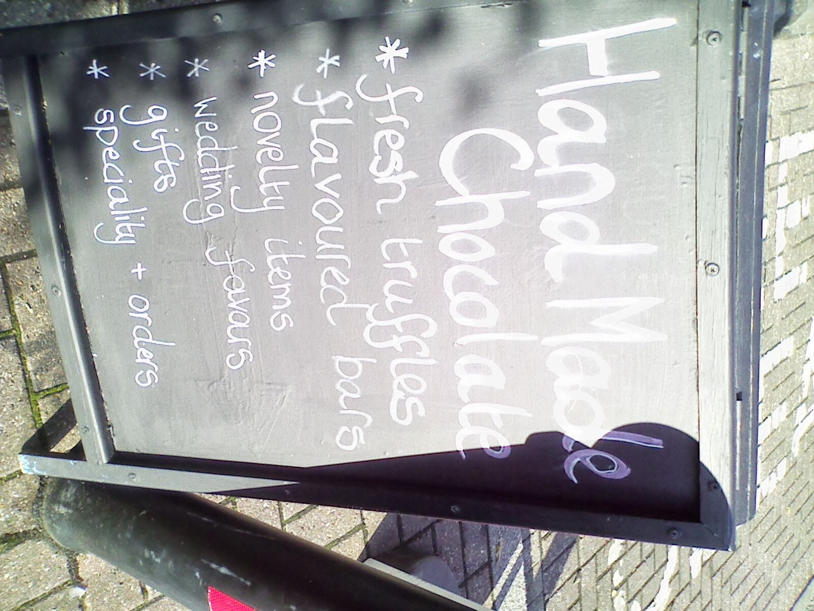
 I looked at 'Coffee & More', also situated in Leighton Town. I love the simplicity of the typography and the logo, as it can work on any materials and colour ranges. The type is easy to read and understand, however the 'Open' sign in the door is quite off-putting. The sign is placed to one side, not directly in the middle which does not look as effective. The colours used and the shape of the sign is very boring, making it look like a Fire Exit sign. This could divert the customers' attention. The menu signs are created from blackboard and coloured chalk. This looks really effective and definitely catches my attention. The images, vibrant colours and funky type make my eyes wander around the menu, drawn to the food ad drinks on offer. The table menus are very simple but effective as they are easy to read. The boards and different promotional offers are eye catching, full of colour and life and the text is imaginative and bubbly.


 The last place that I visited was the bakery. They do not have a wide area of wall space and the shop is very slim, therefore the price list is placed behind the door. This is a bad idea as most people don't look behind doors, so have to keep asking for the price. The logo design and the layout of the opening hours sign looks inviting as it is simple and uses the same colour range.


I also conducted research on two artists to gain inspiration on designs, typography and colour. I looked at Kate Moross and David Carson, as their designs are bases around typography and colour. 

Kate Moross

I looked at Kate's official website, researching about her and her work. Kate is a 26 year old London based creative designer. She is the director of Studio Moross (founded in 2012), has a fascination with 3 sided shapes, illegible typography and freeform lettering. Moross attended South Hampstead High School and studied art foundation at Wibledon School of art. She went on to complete a BA degree at Camberwell School Of Art in 2003. Moross has created nationwide billboards for Cadburys, Signature clothing range for Topshop and illustrations for Vogue Magazine. 


Analysing her work:
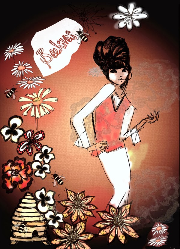
I studied a couple of her designs and I instantly loved them. This piece of work is very funky. I love the use of curly lines, and bubbly text as it makes my eyes wander around the page. However, some of the text is quite hard to read, therefore would take away peoples attention. I love the style, although I need to think about how clear and understandable I need to make my text as the students and adults need to be able to feel comfortable in the environment they are in and the information around them. The colours are very girly, creating a cute theme. By incorporating the red on the refectory walls with blacks and whites, I could create similar designs and  funky typography. I feel that this would look great as it would fit in really well with the theme that I am going for, although I don't want to make it too child like as my target audience is mainly the students as this is their main area to eat and chill with friends. I love how she has used different font types together as it creates a powerful feel. I would like to incorporate this method in my designs. 

I chose this next piece of work as it shows various typography designs, which I could use as inspiration to create my own funky type. I could use this type as imaginative words or phrases on the red walls to create a chilled atmosphere and to break up the red as it does seem quite over powering.  When looking at all the different types, my favourite one is the curly type as it is girly and sweet. It makes me feel happy, although  the curls at the ends look like they are curling up, tight into a ball, therefore making me or others feel isolated from other excited people. The word 'Promise' makes me think of best friends and family promises, secrets and lies, as some of the text is wobbly, therefore unstable and others block capitals, therefore never ending and unbreakable. I feel that the name of the design 'Pencils Of Promise' shows this, showing that you can erase your mistakes is life as well on paper, making up for them. When looking this piece of work up, I saw that this was hand drawn for charity, therefore Promise can be related to changing lives and keeping promises. 

 Moross created banners for creating online webs for Converse Online. The colours used and the typography work really well together as they are both aimed at teenager, young and old. I could use inspiration from these designs to use as different illustrations and designs to go in the walls as I am also aiming my brief at teenagers/students. I love the first banner 'Start Fresh' as it is quirky and fun. I love how Moross has only used four colours in both of the designs as it makes it simple but effective. The second banner could attract younger teenagers as the type is bubbly and the colours and the funky shapes create a younger vibe/feel.  


I went on to research american graphic designer, David Carson. I used Carson's own website and two others on Blogspot to research. Born on the 8th of September, 1995, Carson studied sociology at University. Before becoming a graphic designer, he was a sociology teacher and professional surfer. Carson became the art director for a magazine, named 'Ray Gun'. He is well known for his innovative magazine designs and experimentation with typography. Carson bases his work around making a statement using both typography and images. Each piece of work carrys different messages, which lead to the same conclusion. He tends to work in bleak tones, black and whites and sepias being commonly used. Carson rarely uses splashes of bright colours. He created his work to be aimed at teenagers, rebel like and discarded all type rules. This definitely would appeal to the students in the refectory, which could boost its popularity. 


 In this piece of work, Carson has used a mix of drawings/photography/typography and layering of images to create it. I feel that the thin, black text stands out bluntly from the ghost face, using neutral colours (black, grey and white), making sure that the title of the magazine stands out. I love the simplicity of the design, and incorporating the black blocks in various different letters, as it creates mystery. When looking closer at the design, I noticed how Carson used the strikes from the letter 'H' and used it to form a couple of the letters in the top section. It looks really effective and caught my eye, therefore linking different lettering or numbers together could be a great idea when re-branding the refectory at college. The expression of the women's face looks very blank and simple, and there is no bright colours or enthusiasm included, so I wouldn't design an idea using the neutral colours as it would not be exciting to the students. The layout of the text is clean as I am drawn to the letter A in the middle, then sideways towards the eyes, leading me all around the page. 

In this piece of work, Carson has focused on typography and colour. I love the positioning of each individual letter as it makes me follow around the page. The backwards and upside down lettering creates a funky layout, which catches my eye easily. Carson has used different shades and tones of Red with black, creating a mysterious, blood and gore theme. If I was to use different tones in a similar way, the students could be freaked out and put off by the effects. However, I could use this idea to create funky lettering on the red walls of the refectory, using black and white, would would make the area more eye catching for the students. By laying out shapes and letters in various ways, it would make a more cosy atmosphere, and a funky vibe. It would also break up the bright red on the walls, as this can be too overpowering for the students. I could create stencils out of plastic, or use paint to add the designs onto the wall, Although, to create a similar pattern, I could use large sponges to create a mottled effect, block paint to create a flat effect or add a 3D effect by placing wooden blocks on the letters to make the designs interesting. 

I love this piece of art work as there are various colours and a larger amount of detail involved.The large, coloured numbers catch my attention, however the background image creates a softer theme, therefore I notice it afterwards. The random placement of the numbers make the work seem very graphical and unusual, which often catches the attention of students. By overlapping the letters and/or numbers that I could include in the logo, signage etc, I could relate back to this image as it is quirky, which relates back to the client's needs. Carson creates a smooth, relaxing feel in the background as he is using natural colours, such a beige and browns. Then to add characteristics to the bland image, Carson added bold, simple colours which overlap and see through each other. This makes me think of different personalities, who is real and who is fake. Which characteristics can you see through.