This block of white space is an area right at the front of the college. This space could be used for the logo, including bright colours, and an arrow to show where the refectory is situated. The refectory signs are extremely bland and boring, as they show no imagination and mood. The students would not want to meet their friends in this area as the sign is dull and brings no life. The arrow is a good idea, as it shows the students and the adults where the refectory is in the college, and creates a maze feel.
The menus are very boring and the layout is very simple. which may not attract the students' to buy their food. There is no colour, therefore the menus do not stand out to the target audience.
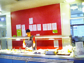
This wall space is incredibly bland, as the white posters against the red wall is widely used for a lot of brands and businesses. The colours are too simple, therefore may not attract the students as well as if it was bursting with colour and vibrant images.
These price tags are good and funky as they are different shapes, however they are hard to read and do not shout out to me to buy the products. The circular price tags are a good idea, however the writing does not fit the size. This would definitely put me off buying the product, as it seems like the refectory has not taken much care in the prices, colours and shapes/images used.
These beams in the refectory are usually in the way a lot of the time, as most students don't know that there is another queue area for drinks and snacks at the other end of the bar, and that students meet up in every corner of the area. Each beam could be used for a different menu, such as one for drinks, one for salad and one for cooked food. These beams would look more colourful, which would attract more attention to the students.
I was looking at the vibe of the refectory, and the different seating areas. I could include various students having a good time around one of the tables for a logo design to create a happy, fun mood.
Different objects in the refectory could be used to advertise the food and drinks menus, by adding posters and giant stickers full of colour. The red bin is one example.
The client talked about leaving the big windows clear of any logos or stickers, as it could make the refectory seem dull, however she did not mention the top, thinner windows. I could create a long, thin strap line sticker to be placed on some of the windows, which may look great on the inside and outside.
These images are from another entrance that students could use when walking towards the refectory. The logos, signs and menu designs could be placed on the wall beside the double doors. The ramp leading up towards the doors could have brightly coloured foot prints painted, which will make the students follow them up to the refectory. I know this would work really effectively as I usually do this a lot with my sisters in other places, such as Ikea or seating areas in Leighton Buzzard Town.
The area where the paving slabs are is a good place to include large signs on the floor area, which would catch the students attention if we was to use bright bold colours, maybe in a style of pop art. Arrows could be placed/painted on the floor, or could be 3 Dimensional to look effective.


No comments:
Post a Comment