I conducted secondary research, using two websites on the internet. The following nine businesses and brands are taken from www.superdream.co.uk/best-advertising-slogans/. I focused on the strap lines and the colour co-ordination on the logos, and how I could incorporate different aspects into my designs.
I used McDonald's as they are a widely known restaurant/business. The strap line is very catchy, simple, effective and successful. 'I'm lovin' it' ties in really well with the company's brand values, as the food that they produce is fast food and cheap. It sticks in peoples' minds, which creates a psychological effect in their minds. The strap line is coupled with the company's signature advert, bright colours and branding. The famous tune sticks in customers' minds and is easily recognisable, especially towards young children. The style helps to create a winning campaign every time.

KFC is a fast food restaurant in competition with McDonald's. Their strap line 'Finger lickin' good, is a long standing advert slogan that reflects the company's values. It tells the audience that the chicken tastes good, which should invite the customers' and the target audience in. This is exactly what you want from a fast food restaurant, cheap and cheerful.

Subway's strap line is very clever as persuades the target market to buy their food. Fast food is notoriously bad for you, so in a bid to position themselves as a more healthy restaurant, 'Eat fresh' was created. This lets the audience know that their sandwiches and fillings and always freshly made and prepared. The strap line is coupled very well with the yellow and green branding, as they are 'fresh' colours. They show the customers a fresh vibe when watching or looking at the advertisements. The arrows could mean that this fast food brand is the only way to go, and I like the fact that they have attached the arrows to the lettering, which makes the whole design flow.

Tesco is a massive company, therefore it needs to have a logo and strap line that is easily recognisable, effective and simple to catch the customers' attention. The text type for the name of the company is very simple, which makes it easy to read. The funky text type for the strap line underneath creates a quirky edge, and pulls in younger customers as well as the typical target audience. 'Every little helps' is famed for Tesco's low prices and their huge stock list. The strap line perfectly reflects this, as the text is bold and bright against the blue underline. The strap line is regularly used in television and printed marketing, because it is very memorable and effective.

Heinz logo 'Beanz Meanz Heinz' is very clever, because not only does it mention the brand name in the strap line, it keeps things short and sweet. It plays on the brans name and the product, making the target audience thinking that Heinz is the best brand to buy if they want baked beans. The colours used are very bland and boring, however the white text against the black background pulls me in. Images are useful to the customer so that they know what product to buy, and what brand to look out for next time. I could include images on the logo, part of the text or on posters/menus around the refectory.

Skittles is a very lively brand, which their strap line 'Taste the rainbow' shows really well. They have used this strap line since 1994, this shows that this is definitely catches peoples' attention. It perfectly reflects the product, as the sweets feature a wide variety of colours-that of a rainbow. Which is why the image of a rainbow is perfect on the logo and the packaging design. Red is used a lot in this design. This could relate to the fact that red is the first colour in a rainbow, therefore skittles is the first brand/sweets to choose and eat before the others. The text is easy to read, and is mainly placed at the end of the rainbow, which can relate to the childhood memory of finding the pot of gold at the end of the rainbow.

Rice Krispies's strap line is clever as it is also connected with the characters for the advertisements, 'Snap! Crackle! Pop!'.It has been synonymous with Rice Krispies since the 1930's. As well as being some great mascots, the three onomatopoeic gnomes make for a great long lasting slogan. It is said that when the cereal creates a 'snap crackle pop' noise when milk is added, it is hugely effective for the customers, especially the younger children and for Kellogg's. The colours are very cool, creating a calm atmosphere, which is needed in hectic mornings!

Kit Kat's 'Have a break, have a Kit Kat' is a lunch box favourite for the younger audience. The colours attract their attention, and the logo design is easily recognisable. It is used in printing and TV advertisements, as the tag line reflects how quick and easy the wafer bars are to snap and eat. It is simple and easy to remember, which is much like the company's red and white branding. I would not use a similar colour theme as Kit Kat, as it is very typical and could be quite overpowering if there is too much in the refectory area.


The next few company's are taken from www.ad.mad.com/slogans.
7UP - 'Freshen up with 7UP'. This is effective as it is easy to say and remember because it rhymes. It is catchy, and the two complementary colours create an inviting logo design. There is not too much going on, larger areas of negative space are shown, which would attract customers more.

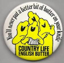
These two are taken from Country Life butter, their strap line is very tongue twisting, however it is quirky and effective. 'You'll never put a better bit of butter on your knife' is the catchy strap line. The logo is very creative as they used a letter to create an image relating to the name of the product. They have recently developed funky styled characters, which could attract customers to buy this product.

No comments:
Post a Comment