Tuesday 25 February 2014

Final sheets for client


The poster sheet for my client:


The character sheet for my client:


Materials and Experimentation

I looked at a variety of materials that I could use for the poster, to make it interactive with the younger audience. I found this very helpful as I found out what materials were easy to stick and use on the paper/card, and which materials did not work very well, or looked messy.

I feel that one of the best materials to use were the different types of card, such as shiny and corrugated, as they showed a lot of texture, which could make the children understand the topic more and they would be pulled into the poster easily and effectively. Another material was the cotton wool, as they are very realistic and usually used to show clouds in other arts and crafts. The children would easily understand what they poster is trying to show them, and by using dye, we could dye the cotton wool and darker grey, making the cycle easier to follow.
I think that one of the worse materials to use was the moss, as this stunk a lot when I opened the packet, which instantly put me off. This type of material can easily go mouldy or die, making the poster look very unattractive, and put the adults off as well as the children. I did however, like the idea of having a material that was funky to feel and smell, as it gives the children a feel of what the water cycle would be like.
Overall, I am happy with the materials that I worked with, and thought that the cards, cotton wool and  patterned wallpaper all would work well on the poster, as they would show the children what the cycle was really like in a funky way.
The layout sheet I had created with the materials and my annotations.


Monday 24 February 2014

Character Final

I created a 3D model of my character, using chicken wire, mod rock, wire, different shades of green, and yellow, black paint, bamboo sticks, bottle lids, polystyrene boards, and foiled tin chinese paackage boxes.  I found it challenging as I created my model larger than I expected.  However, I feel that it looks funky.

The Stages:
Once I created the shape of the character out of chicken wire and regular wire, I used mod rock and water to create a base. I waited until it was hard an dry, ready to add paint. I found it relatively easy, however the model that I created was pretty large, therefore I had to use a lot to make the base easier to work on. This meant that it took longer to dry, making it more time consuming. I feel that if I repeated this stage,  I would made the model smaller, then it would be more easier to create, and add materials. I feel that by creating more layers of mod rock onto the model, I would have created a more sturdy base, making it stronger. 

I started adding green paint to the head and the rest of the body of the character. I used up a lot of paint as I created a large model, which again was time consuming. 


I used polystyrene plates to cut out triangle shapes, and painted them black to create spikes for he tail. I feel that by using this material, the spikes were sturdy, making the model easy to construct, and able to move around without breaking any areas. If I was to repeat this stage, I would paint the polystyrene boards black first, let it dry, then cut out the triangles as I found it hard to paint them while holding them with my fingers.  

I used wire and the Chinese tins to create a mouth for my character. I drilled holes in the model,  and created a loop in the wire to hook the wire through. I found this pretty difficult as it was hard to guide the wire to the holes through the chicken wire, as it kept getting caught. Therefore, if I was to repeat this idea a second time, I would add the wire through the holes first, making sure that I don't get it glued with the mod rock, ready for the attachment of the mouth.

I created a tongue, by using a long tissue roll, glue and red paint. I was pretty happy with this as it gave the model some character, making it seem fun. It was pretty easy to build as I used a strong glue to hold it together. 

The finished model
Evaluation: I feel really happy with the finished character model as it looks fun and exciting. The colours that I used linked to the name of the Eco Farm - The Green Dragon, as it gives it an identity. The colour green can also be known as a 'happy colour', making the younger audience seem happier, and more relaxed. However, I do feel that the character is a little scary for the younger children, especially the mouth as it looks like it's about to eat them. I am happy with the materials that I used, as they are recycled, meaning they are easy to collect. They were fun to use, and showed the dragon like features easily. 

The final images:


Poster Final

I created a poster in Adobe Illustrator, using Adobe Photoshop to add colour. I found this pretty easy as I understand the software, and how to create the shapes I needed. I also used a Bamboo Tablet to help me draw the outlines for the shapes, such as the clouds and fish. I am really happy with the final design as it looks fun and is understandable for the children. The illustrations are simple and easy to follow, and the text is easy to read and makes sense for the children. I feel that if I was to repeat this design, I would make the body copy more simple, using less-complicated language for the children, as I feel that the text may be a bit hard for the children to fully understand, which could put them off from learning.
The stages: 


Evaluation Of Final Pieces
I am really happy with my my final poster design, as it is easy on the eye, and very eye catching to the younger audience, as well as the information graphics. I feel that the type styles that I used were simple, however easy for the children to understand and read. I used Myriad Pro as the main body copy style and for the heading, increasing the strokes to make it bolder, to show hierarchy. I had planned to use different type styles, however Adobe did not provide these. Therefore, if I was to repeat this idea, I would make sure that I had chosen styles that were easily accessible, making my design easier to construct. I have learned more skills when using Adobe Illustrator and Photoshop, making the design easier to construct. I found it pretty easy to design, as the images that I used were pretty basic. 

The main body copy:

The full design on Illustrator:
 

The character design in the corner of the poster:

The main part image of the poster, showing the water cycle:

Monday 10 February 2014

Poster Design Layouts

I created layouts for the design of my poster, showing the children about the water cycle. I started designing ideas that came to my head about the layout of the poster, the shape and where the text and images would be.

I then developed one of the designs that I liked the most . I looked at the layout of the type and the different colour themes that I could use. I make the type spacing larger so the children would be able to read the text better. The colours relate to the theme of the water cycle, making it seem fun and understandable to the children. 


 I then looked at the type styles. I focused a lot on what styles the children would be able to read more clearly as they are at a young age and I want them to learn something from looking at the poster. I showed a couple type styles that are not very good, as they are not very clear for the children to read and understand, therefore not learning anything.

I focused on the images, the colours and the mechanisms that could be added to the poster, making it seem more fun and interactive for the children. I used bold colours, easy imagery and black outlines to make it simple for them to understand. I thought of a couple ideas that would make the poster interactive with the kids, for example I could use materials on top of the image, such as cotton wool for the clouds, I could attach flaps with the information underneath, I could use fuzzy felt so that the children could move the parts around, or I could use pull tabs so that the children are able to see that movement of the cycle. All these are fun for the children, and make their learning more effective.

I also looked at the body copy and the keywords that I want the children to be able to read and understand. I used easy language so that they are understandable for the kids.

This is my final design layout sheet, the image, the interactive part - I chose added materials onto the poster, as it is funky and looks really good, also flaps for the information underneath the image, with the body copy and the type styles that I will use for the heading and the body copy. I am pretty happy my final idea as it is easy to understand, helpful, colourful and interactive with the children.

Character Design Layouts

These are the layouts that I designed when developing my character design. I started creating ideas that came to my head, that I could create out of recycled materials. I thought of using materials such as bottles, cans, lids, buttons, card and clogs. I wanted to use a variety of materials to amaze the children and the client. I am pretty happy with the designs I created as they are very different from each other, and would look fun for the children. 


I then developed three ideas, looking at the colours I would use, the interactive function it would have for the children about the economy, why I chose to develop them and what it would look like.


I then chose a design to develop even further, into a 3D model. I looked at  the different colours and patterns that I could use and design onto my character.

I designed a final design layout sheet, which I would use when creating my character on Adobe Illustrator. I included what materials that I will be using, the colours that I have chosen and why. 


Thursday 6 February 2014

ECO Farm trip

On Thursday, me and the class when to the Eco Farm, now named Green Dragon Eco Farm, in Bicester. I found this trip pretty helpful as I got to understand what the client wanted when I met him in person and what the farm looked like.

Wednesday 5 February 2014

Primary Research

I collected various brochures and advertising campaigns for Eco farms and other eco-like areas in the UK. I noticed that the use of the colour green was used a lot in the design element of the leaflets etc. This is mainly because keeping the planet 'green' ,meaning to keep it healthy, is what they are trying to put across. Green is also referred to as a happy colour, therefore this would make the audience feel happy when helping keep the planet healthy.

1)  'The Outer Aylesbury Ring' leaflet 
What I like about the design and why - The layout is very easy to follow, as the headings are clear. The Layout looks professional, as the thin green borders around the images make the design look clean. The use of the darker shade of green makes the reader automatically think of the economy and the environment.I like the use of reverse type, as is is easy to read. The images are detailed, which will enticing for the readers.
How would I change the design and why -
How they are advertised to schools - I feel that this leaflet doesn't really advertise for the school children, more for the parents, just to let them know what is going on in that area. I feel that they are not interesting and colourful enough to attract the younger audience.


2) 'Friends Of Tiddenfoot Waterside Park' Newsletter
What I like about the design and why - The structure is very simple, making it easy to follow and understand. The body copy is simple and easy to find what information you want. The type style is mainly aimed for teenagers or middle aged adults as the point size is quite small. therefore they would find it easier to read. The younger and older audience would find it difficult as they have included larger words, which the younger audience may find hard to read and a smaller type size, which the older people may find hard to see clearly.
How would I change the design and why - I would definitely add some more colours, as it doesn't look very exciting. The images are good but they are not very detailed, therefore they don't appeal to the audience.


Dunstable Library
I also visited the Dunstable Library, looking at the children's area, the books, 3D elements added to create a cosy feel, type used etc. It definitely helped me to understand what the target audience want when designing for books, posters, or any other interactive children's work.
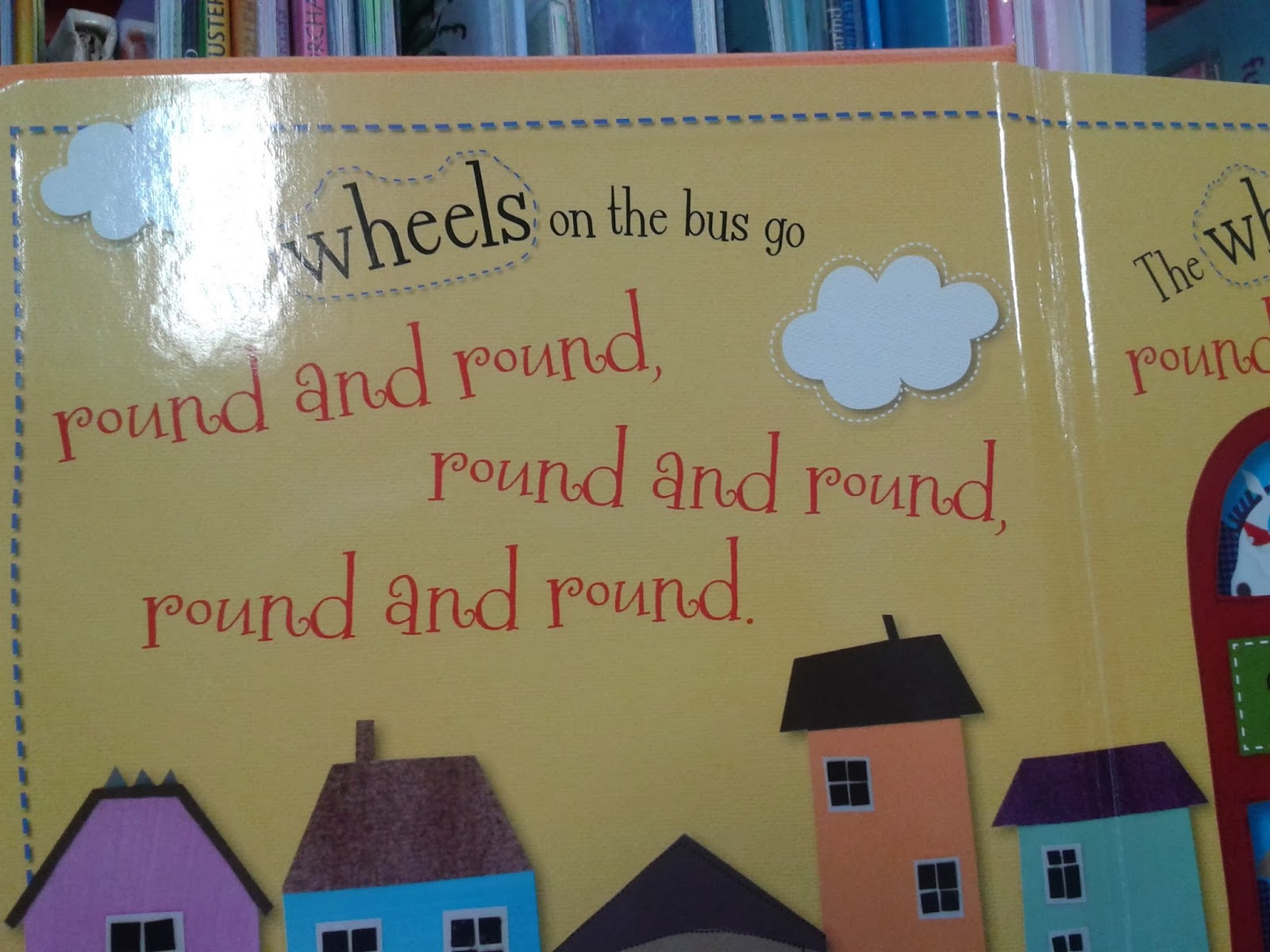
I looked at various pop-up books and touch & feel books, which include fake fur or cotton wool to show the children what the animal's fur feels like. I looked through a range of books and compared the type styles that were used. I felt that the simple, clear styles like Helvetica or Times New Roman are more effective as the children are able to read it clearer and understand it better, therefore learning faster. The books with swirly type styles that did not sit on a base line were not very clear, making it harder for the children to learn quicker and more effectively.
I took images of the letter blocks as this is a very effective way for children to learn their alphabet. For example, A for apple, B for balloons and C for cat. The images and lettering are very clear. I looked at the elements in the children's section in the library as it created a cosy, relaxed atmosphere for the children. I looked at the sofas, chairs, carpets and book boxes - trains and trees. The colours are very bold and bright, and easy to recognise shapes and images. The train and the tree book boxes make the children feel at home, or at school in a fun working environment, where they can enjoy learning. The carpet designs are fun and bright, simple and effective.
I looked at 'The Usborne Internet - Linked Children's Encyclopedia' which was very informative when looking at the water cycle - which is what my poster will be on. The two pages show all about the weather, rainbows and snowflakes. On the right hand spread, there is an interactive area that shows the children how to make their own rainbow. This is good as the children again are learning more information while doing the activity. I noticed that in all the books that I looked in, the heavier the weight of the type style, the higher the hierarchy of the information given. The illustrations included in the books were fun and messy looking, which is a little like children's drawings at that age. Therefore, they would feel more at home with the designs.

I also researched a few books that showed negative points, which I am able to look out for when designing my own character on layout sheets. I looked at the front cover, the type styles used and the layout of the pages.  I feel that the images used were pretty old and very detailed, therefore may confuse the children and over complicate their learning if I was to include images like these on my poster.
In the 'Teen' section of the library, the teen poster is very bias, as it shows that teenagers are all chavy and dull, therefore this could put the audience off. I need to think about my target audience, what language and type style I use, and what colours and images I include. I feel that that by keeping the type style the same colour, usually black, this makes it easier to read and take in the information easier, as different colours could mean different things to different people and the children may get confused. I noticed that when looking through these other books, the layout looked a lot like subject/exercise books, which may put them off as they are pretty boring to look at and read from therefore not taking in the information effectively. The front covers also could look boring to my target audience as there is hardy any colour, bold images or funky writing. However, the layout is pretty simple. which makes them easy to recognise and understand.
I could adapt these negative points by changing the colour to black or white, and keep it the same point size and colour. I would also keep the body copy in short sentences and easy language so that it is easy and simple for the children to understand, therefore creating a more effective way of learning. I would change the type style from curly, detailed hand writing to a simple, understandable style like Helvetica. This way there is no confusion and the children can.