I conducted secondary research, using three different company's and websites.
The first company I looked at was Starbucks. Their website is structured, however it is quite plain, therefore it would attract older customers. They have used various neutral colours, which can suggest a lounge-around feel. I looked at www.yelp.co.uk which showed me different reviews from a couple of people. The dining area was situated in Slough. The first review I looked at gave Starbucks a 5 star rating. They said 'It was a chilled, relaxed atmosphere, with smiles all round. The staff are very polite and the chairs were comforting'. Review two gave a 3 star rating, saying ' As well as serving coffees and a variety of drinks, they serve lunch time food. Inside is very cosy and the theme is art softening'. The next review is from Harrow. They gave a 4 star rating, saying that the seating area is very spacious and the menus are easy to read'.
I used a website called gourmet-coffee-zone.com/starbucks-logo.html to find out what the Starbucks logo means. The logo has achieved broad, visual recognition, equal to familiarity to the brand name itself. The image is of a certain mystique that surrounds the trademark. The mythical two-tailed mermaid, named Siren. The Siren was take from Greek mythology and was an alluring, irresistible female figure, typically half fish/half women. The Siren's objective was to seduce the seagoing mariner with a powerful, enticing song most often to the unfortunate demise of the susceptible sailor who could not resist temptation. The rings around the mermaid and the brown colour scheme was designed to resemble a cigar band label.
I looked at the company's website to research the history, looking at the page 'About Us'. The first Starbucks opened in 1971, and was a single store Seattle's historic pike place market. The name, inspired by Moby Dick, evoked the romance of the high seas and sea faring tradition of the early coffee traders. Howard travelled to Italy and became captivated with the Italian coffee bars and the romance of the coffee experience. He had a vision to bring the Italian coffee house back to the United States. It is a place for conversation and sense of community. It is known as a third house, between work and home. It celebrated coffee and rich tradition but also bought a feeling of connection. They have more than 15,000 stores in 50 countries. The menus are structured as it flows really well. They have used the same text type all the way through, which creates a clear view. They are simple, easy to understand and bold, however they are not very eye catching.
Starbucks Mission Statement:
'To inspire and nurture the human spirit, one person, one cup and one neighbourhood at a time'.


Next, I looked at KFC. The website was quite short, however it was well structured and simple. I looked at the 'About Us' page on their website when researching the history of the fast food restaurant. The founder, Harland Sanders was born on September 9th, 1890 in Henryville, Indiana. Around 1920 to 1929, Harland lived a life of country song - working his way around the southern states. In 1930, Harland (now 40) bought a roadside motel and cafe in Corbin, Kentucky, and opened KFC. In 1965. Southern style chicken came to the north of England - Preston. They refreshed the logo design in November 2006 and right now. they have 800 UK restaurants.
The logo design information I researched on www.dineish.com. Colonel Harland has always been part of the logo; overtime his face became more friendly, as it was serious before hand. The red in the logo gives it a more bold, lively look. They renewed the logo again in April 2007, where the colonel shed his white suit jacket for a red apron. The logo includes bolder, brighter colours, more well defined visual image, and kept the famous black tie, glasses and goatee. The smiling colonel is featured against a red background, which matches his red apron, and with the KFC brand name in thick, black lettering under his chin.


I also looked at a theme park to research the colours and designs as this is also aimed at the same audience as the refectory. I chose Thorpe Park as they are very popular. The website is very funky, and includes a different variety of text types. It uses bright, bold colours to pull the audience in. The logo is very self explanatory, catches attention, vibrant and used blue and orange which bounce of each other because they are complementary colours.


In this design, she has used bright, bold colours making the mood very fun and bouncy. When I look as this design, I feel that the circular shapes definitely relate to the main point of the design - The discovery project. By looking through the middle of the circles, you are discovering what is there, therefore discovering what you can do with your life. The bold colours make me think of a bright future, and the circles tell me that you will never be forgotten or lost as the circle of life never stops. they keep going and never breaks. However, I also see the circles as a negative point as they never end, therefore it would be hard to remove yourself from a tricky situation as it would just keep going round and round in your life, our mind and the circle. The way the circles interlock create a good sense of safely and partnership in our lives, therefore creating a good state of mind when I look at this design. By using bold, bright colours in my designs, this would also create a happier, funky vibe in the refectory.

This design is very clever as you can easily see what the designer is trying to show and what the packaging is selling. By using the different, bright colours the mood is very calm, making me think of the beach and ice-cream, therefore the summer time. There is also a lot of white space, which also creates a calmer mood when looking at this design.


This illustration is again very girly, which is easily shown through the colours and imagery. I love how the background is blurred, creating all the focus on the girl and her shopping which is what most girls liker to do best. The girl looks very indecisive, which can be shown by the many pairs of shoes at her feet. I could incorporate this in my designs as it can be hard to choose what to eat from the refectory.

This image looks a lot more dark, creating a creepy vibe. To liven this up, I would had bright, bold colours splashed onto the image in various places. This would make a funky design, pulling teenagers in to a more quirky atmosphere. However, when noticing the line drawings in the black areas, I am pulled into the image even further. It looks very clever as it follows around the face - white space.


I love this design as it is so simple, yet effective. The idea of the shapes all broken up pull the teenage audience in as they don't fit together, making the idea of being perfect destroyed, When I look at this design, the broken pieces show me that no one is perfect yet you can still create a picture, therefore building up a structure to your life. The image of a lion shows me to never be afraid of what will happen, take it as it comes. The colours used are very cool and show me the feeling of trying harder rather than feeling down or upset The darker areas show me that there will be hard times, but that you will get through it.

This design is very bright and happy, which is what I want to immediately show in my designs for the refectory. The yellow glow in the middle against the lime green background shows me that there is fun ahead of you when you drink sprite, therefore creating a sense of belief when the viewer sees this poster and buys the drink. I hope to do the same thing with the colours and imagery that I use when I re-brand the refectory.

I looked at the company's website to research the history, looking at the page 'About Us'. The first Starbucks opened in 1971, and was a single store Seattle's historic pike place market. The name, inspired by Moby Dick, evoked the romance of the high seas and sea faring tradition of the early coffee traders. Howard travelled to Italy and became captivated with the Italian coffee bars and the romance of the coffee experience. He had a vision to bring the Italian coffee house back to the United States. It is a place for conversation and sense of community. It is known as a third house, between work and home. It celebrated coffee and rich tradition but also bought a feeling of connection. They have more than 15,000 stores in 50 countries. The menus are structured as it flows really well. They have used the same text type all the way through, which creates a clear view. They are simple, easy to understand and bold, however they are not very eye catching.
Starbucks Mission Statement:
'To inspire and nurture the human spirit, one person, one cup and one neighbourhood at a time'.

Next, I looked at KFC. The website was quite short, however it was well structured and simple. I looked at the 'About Us' page on their website when researching the history of the fast food restaurant. The founder, Harland Sanders was born on September 9th, 1890 in Henryville, Indiana. Around 1920 to 1929, Harland lived a life of country song - working his way around the southern states. In 1930, Harland (now 40) bought a roadside motel and cafe in Corbin, Kentucky, and opened KFC. In 1965. Southern style chicken came to the north of England - Preston. They refreshed the logo design in November 2006 and right now. they have 800 UK restaurants.
The logo design information I researched on www.dineish.com. Colonel Harland has always been part of the logo; overtime his face became more friendly, as it was serious before hand. The red in the logo gives it a more bold, lively look. They renewed the logo again in April 2007, where the colonel shed his white suit jacket for a red apron. The logo includes bolder, brighter colours, more well defined visual image, and kept the famous black tie, glasses and goatee. The smiling colonel is featured against a red background, which matches his red apron, and with the KFC brand name in thick, black lettering under his chin.
I also looked at a theme park to research the colours and designs as this is also aimed at the same audience as the refectory. I chose Thorpe Park as they are very popular. The website is very funky, and includes a different variety of text types. It uses bright, bold colours to pull the audience in. The logo is very self explanatory, catches attention, vibrant and used blue and orange which bounce of each other because they are complementary colours.
Artist Research
Kate Moross: I looked at her website to find out about what and how she designs. Moross is a 26 year old London based creative designer. She is the director of Studio Moross, has a fascination with 3 sided shapes, illegible typography and free form lettering. Moross studied at South Hampstead High School for primary and secondary school. She studied an art foundation at Wimbledon school of art, and went on the complete her BA degree at Camberwell school of art in 2008. Her achievements include billboard campaign for Cadbury's, a signature clothing rage for Topshop and illustrations for Vogue magazine. She regularly speaks at art conferences and has sat on the jury for the D&D Awards in 2012. From Wikipedia
I love this line illustration as it is so simple against the powerful coloured background, so it stands out because of the lighter line drawing. The simplicity of the design creates a funky, relaxed mood, which is what I want to incorporate when I re-brand the refectory. By adding more detail to the darker areas of the face, I am able to recognize what is being put across on the album cover. The colours definitely pull me in as they are calm and cool, creating a fun but relaxed mood.


DesignJuices.co.uk: I found a couple of designers on the website.
Sonya Parra: Based in Leicester. but often working in London. her work is inspired from fashion, art, illustration and concept art. Parra had said 'My style is often described as feminine, pretty, sexy or edgy, depending on the piece with colour and lighting fascinating me the most. I try to create mood and love the human form'/If I was to use Parra as inspiration, I would take note of the illustrations and the way that she creates them, and keep away from the feminine side as the refectory is used by both genders. Her favourite media for drawing are ink, charcoal, non waterproof fine liner, marker pens, layout paper and textured water colour paper. I could use one of these methods when creating an experimentation piece.
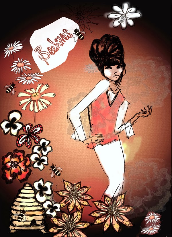
I love this illustration as it comes across happy and lively as the colours are very relaxing. I am ultimately pulled into the bright lights and colours in the middle make me think of happy times and smiles, however when I look out and around the page, I think of dark secrets linking to the darker colours. The flowers around the left hand side and the bottom create a girly feel, reminding me of secret gardens. The different types of flowers make me think of the different moods that you can through, so i could relate this in my work to show what different things happens in college.


Luka Molnar: she is a graphic designer and illustrator from Hungary. She has worked as an illustrator since 2006, with her works being featured in magazines all over the world, for all different companies. Molnar's work is very simple yet complex, mixing geometric shapes with neon colours, making it seen funky and relevant. She uses inspiration from lyrics to fashion magazines, making her work unique and detailed.
This typography design is very funky and suites my target audience very well. By going against some of the type rules it pulls teenagers in as those years are seen as breaking the rules, making the most of what you have got and live your life.


No comments:
Post a Comment