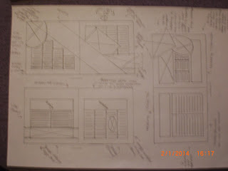
I created layouts when I deigned my V and A poster, double page spread and the extra single page spread. These are the final designs for all of the above. I looked at the images I would use, the layout of the spreads, the text style I would use for the body copy, headings and subheadings and positions for the headings, images and body copy.
I printed off different sizes of the VandA logo, which I could use when designing the layouts.
I looked at different type styles on Adobe Illustrator , looking at what they look like on paper and looking at the size that I could use.
My poster layouts:
The final design
Double - page spread layouts:
The final Design:


No comments:
Post a Comment