I designed layouts to create a single page spread, including my own work inspired from artists that I had researched and a little body copy on myself becoming a graphic designer. I looked at the layout, the images I would be using, the text style and what my body copy includes.
I then designed my final idea in Adobe InDesign, on a single page spread. I included 5 images, all pieces of work that I have created, influenced by three different artists.
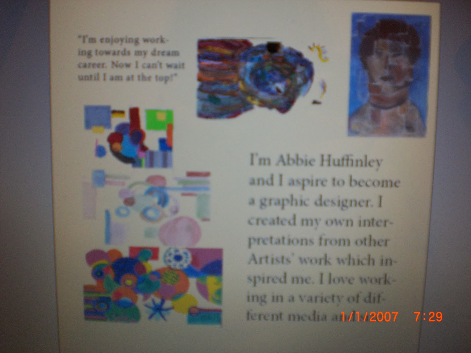
This is the overview of the final one page spread, showing my own work and information on what I am trying to show, about me and wanting to become a graphic designer.
Close ups of the text that I included in the spread. I included a quote in the corner, giving my own opinion on working towards my goal. This also acts as a small heading, inviting the readers in and giving them an idea on what the spread is about.
 My own body copy - explaining who I am, and what I want to achieve in the future and what I have included in this spread.
 Close ups of the images of my work that I have included. In the image below, I showed the three pieces of work that I created, inspired by
 This is the 3D work that was inspired by
 This work was inspired by

(Note: The dates on the images is incorrect, the battery on my camera set itself up to 2007.)
Evaluation
I am pretty happy with the final design of the spread as the layout looks fun and the body copy is easy to read and understand. The sizes of the images all work well with the amount of text that I have included, and they flow, making the spread easy to follow. I kept within the margins, making the layout look simple and easy to follow. If I was to repeat this design, I would definitely think about placing the body copy somewhere else around the images or a would change the point size as there was a few hyphenated words. Therefore the text would look more professional. I am also happy with the pieces of work that I have included, my favourite piece is the 3D artwork, as it stands out and I found it interesting when using the pastels as a medium. I used two columns when typing my body copy as it would be easy to read and what attract the readers along with the images.
This is the overview of the final one page spread, showing my own work and information on what I am trying to show, about me and wanting to become a graphic designer.
Close ups of the text that I included in the spread. I included a quote in the corner, giving my own opinion on working towards my goal. This also acts as a small heading, inviting the readers in and giving them an idea on what the spread is about.
(Note: The dates on the images is incorrect, the battery on my camera set itself up to 2007.)
Evaluation
I am pretty happy with the final design of the spread as the layout looks fun and the body copy is easy to read and understand. The sizes of the images all work well with the amount of text that I have included, and they flow, making the spread easy to follow. I kept within the margins, making the layout look simple and easy to follow. If I was to repeat this design, I would definitely think about placing the body copy somewhere else around the images or a would change the point size as there was a few hyphenated words. Therefore the text would look more professional. I am also happy with the pieces of work that I have included, my favourite piece is the 3D artwork, as it stands out and I found it interesting when using the pastels as a medium. I used two columns when typing my body copy as it would be easy to read and what attract the readers along with the images.
No comments:
Post a Comment