I looked at different magazines on the internet, analysing the colours and typography used and the layout.
The first magazine was Eye Magazine, specifically Indian Graphic Design. It was published by the Delhi-based brand consultancy CoDesign.
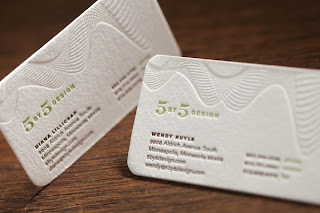
I looked at a website called 'howdesign.com', which gave me various different magazines and busines. I looked at '5 By 5 Design', a business,which was created by Wendy Ruyle and Diana Lillicrap, about six years ago. They have designed for clients from fitness to music and museums. Lillicrap said on the website: "We offer creative ideas managed at the level you'd expect from a large agency". This shows that their designs are to a high standard. This images are taken from their own website, 5by5design.com, showing a range of what they design. The designs for their business are very simple, using funky numbers, lettering and typography.
This image is of designs for Welcyon, launching a new healthy club for aging adults. By using a strong brand story, and a series of engaging communications, Welcyon has a bright, bold identity. By using a shiny red as the main background colour, and reverse type, the typography really catches my eye. The layout of the font is very simple, making the customers turn their heads to read the type, already creating fitness, which links to the main idea of the merchandise. However, red is mainly used for stopping or sadness, therefore the colour may interrupt with the adults training and fitness.
His artwork is very funky and dynamic, making an image form in my mind when I look at the paintings.
These two paintings link into an 80's theme really well as the colours are bright and funky.The swirly patterns and bold black outlines catch my attention quickly, which is what I want to create on my magazine.

The first magazine was Eye Magazine, specifically Indian Graphic Design. It was published by the Delhi-based brand consultancy CoDesign.
I looked at a website called 'howdesign.com', which gave me various different magazines and busines. I looked at '5 By 5 Design', a business,which was created by Wendy Ruyle and Diana Lillicrap, about six years ago. They have designed for clients from fitness to music and museums. Lillicrap said on the website: "We offer creative ideas managed at the level you'd expect from a large agency". This shows that their designs are to a high standard. This images are taken from their own website, 5by5design.com, showing a range of what they design. The designs for their business are very simple, using funky numbers, lettering and typography.
This image is of designs for Welcyon, launching a new healthy club for aging adults. By using a strong brand story, and a series of engaging communications, Welcyon has a bright, bold identity. By using a shiny red as the main background colour, and reverse type, the typography really catches my eye. The layout of the font is very simple, making the customers turn their heads to read the type, already creating fitness, which links to the main idea of the merchandise. However, red is mainly used for stopping or sadness, therefore the colour may interrupt with the adults training and fitness.
This image is of a range of designs for Gopher News Company. They hired 5 by 5 Design to create branding, strategic planning and communication design. From identity to messages to creative in-store marketing tools, 5 By 5 Design repositioned this historic brand as a current, resourceful partner to retailers across the region. I think that these designs include an 80's feel, even if they haven't intended to. The colours are very bold and bright, catching attention instantly, and relate to the chosen type, such as 'Bridal' has used baby pink in the background, showing a very girly feel. The ring round the circles give the designs a border, making it look more professional. The typography relates to the theme, which makes the designs easy to recognise for the client and the target audience. An example could be 'Bridal' as the type used is very girly, curly and pretty, which would be eye catching to women.
I also looked at muralist Ian Ross, a SanFrancisco based artist, whose graffiti-inspired murals fill the offices of high tech-films such as Facebook, Google and Alpha-boost. He was a surfer before becoming a painter, this sport shines through in the energy and flow of his murals. He told the magazine: "Ocean waves are just energy moving through water, and waves have inspired me to create an energetic force in my work".


Very nice. The blog provides all the required information which ensures that client get all the necessary knowledge. Find such blog here which provides secondary research consultant who ensures that client get increase ROI: https://www.piemultilingual.com/market-research-services/financial-research/
ReplyDeletethanks for this post
ReplyDeleteclick here