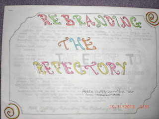
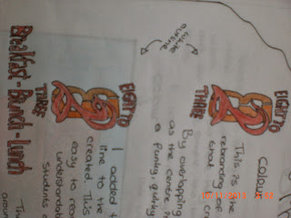
I created these originally for the client's final pieces, however they were not to the finishing standard, therefore I used these as the final stages in the development. I wrote about the designs, what they are for, why I designed them like they are and how I designed them. I wrote about why the would be useful for the client and the refectory. I originally created the designs in Adobe Illustrator, however for the finals I coloured them in using colour pencils just to show how they would look with the colours that I have chosen.
Re-branding The Refectory
The Name - The Eight To Three Canteen
The Logo - In colour and in black and white
Signage - The Open/Close Sign
The Welcome Sign - In colour
Wall Illustrations - In Colour


No comments:
Post a Comment