1) 'The Outer Aylesbury Ring' leaflet
What I like about the design and why - The layout is very easy to follow, as the headings are clear. The Layout looks professional, as the thin green borders around the images make the design look clean. The use of the darker shade of green makes the reader automatically think of the economy and the environment.I like the use of reverse type, as is is easy to read. The images are detailed, which will enticing for the readers.
How would I change the design and why -
How would I change the design and why -
How they are advertised to schools - I feel that this leaflet doesn't really advertise for the school children, more for the parents, just to let them know what is going on in that area. I feel that they are not interesting and colourful enough to attract the younger audience.
What I like about the design and why - The structure is very simple, making it easy to follow and understand. The body copy is simple and easy to find what information you want. The type style is mainly aimed for teenagers or middle aged adults as the point size is quite small. therefore they would find it easier to read. The younger and older audience would find it difficult as they have included larger words, which the younger audience may find hard to read and a smaller type size, which the older people may find hard to see clearly.
How would I change the design and why - I would definitely add some more colours, as it doesn't look very exciting. The images are good but they are not very detailed, therefore they don't appeal to the audience.
Dunstable Library
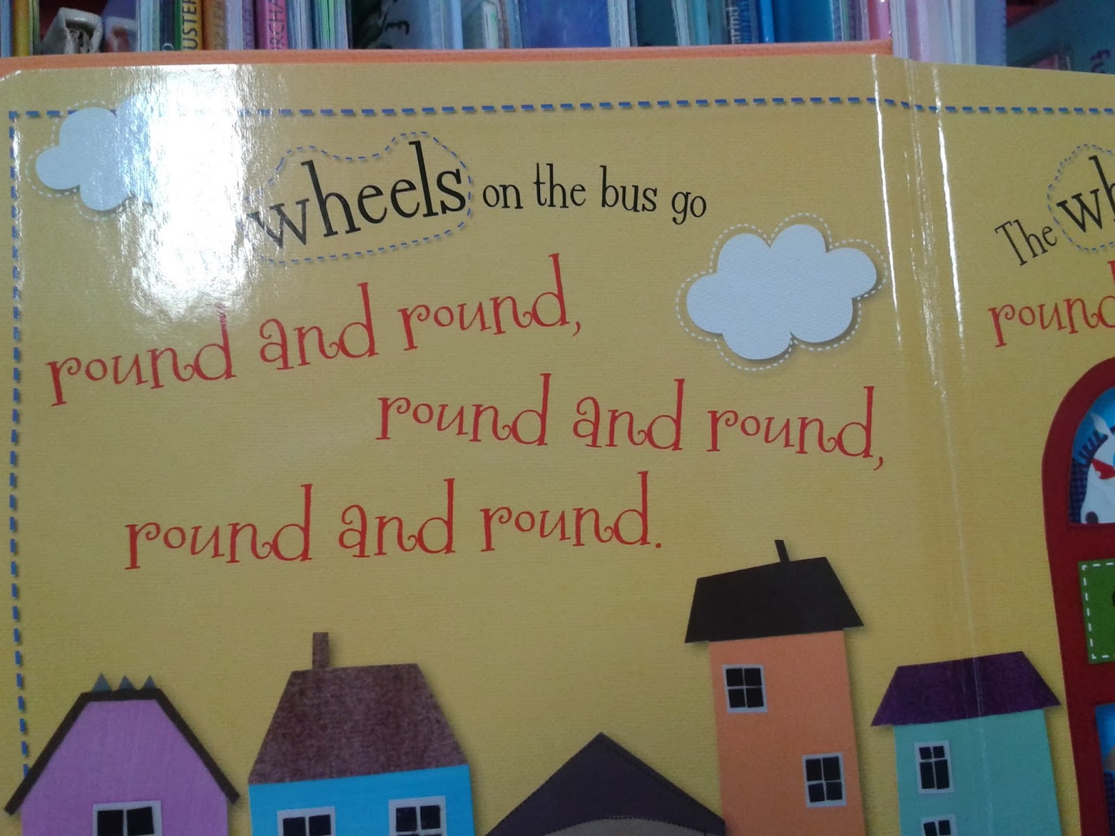
I looked at various pop-up books and touch & feel books, which include fake fur or cotton wool to show the children what the animal's fur feels like. I looked through a range of books and compared the type styles that were used. I felt that the simple, clear styles like Helvetica or Times New Roman are more effective as the children are able to read it clearer and understand it better, therefore learning faster. The books with swirly type styles that did not sit on a base line were not very clear, making it harder for the children to learn quicker and more effectively.
I took images of the letter blocks as this is a very effective way for children to learn their alphabet. For example, A for apple, B for balloons and C for cat. The images and lettering are very clear. I looked at the elements in the children's section in the library as it created a cosy, relaxed atmosphere for the children. I looked at the sofas, chairs, carpets and book boxes - trains and trees. The colours are very bold and bright, and easy to recognise shapes and images. The train and the tree book boxes make the children feel at home, or at school in a fun working environment, where they can enjoy learning. The carpet designs are fun and bright, simple and effective.
I looked at 'The Usborne Internet - Linked Children's Encyclopedia' which was very informative when looking at the water cycle - which is what my poster will be on. The two pages show all about the weather, rainbows and snowflakes. On the right hand spread, there is an interactive area that shows the children how to make their own rainbow. This is good as the children again are learning more information while doing the activity. I noticed that in all the books that I looked in, the heavier the weight of the type style, the higher the hierarchy of the information given. The illustrations included in the books were fun and messy looking, which is a little like children's drawings at that age. Therefore, they would feel more at home with the designs.
I also researched a few books that showed negative points, which I am able to look out for when designing my own character on layout sheets. I looked at the front cover, the type styles used and the layout of the pages. I feel that the images used were pretty old and very detailed, therefore may confuse the children and over complicate their learning if I was to include images like these on my poster.
In the 'Teen' section of the library, the teen poster is very bias, as it shows that teenagers are all chavy and dull, therefore this could put the audience off. I need to think about my target audience, what language and type style I use, and what colours and images I include. I feel that that by keeping the type style the same colour, usually black, this makes it easier to read and take in the information easier, as different colours could mean different things to different people and the children may get confused. I noticed that when looking through these other books, the layout looked a lot like subject/exercise books, which may put them off as they are pretty boring to look at and read from therefore not taking in the information effectively. The front covers also could look boring to my target audience as there is hardy any colour, bold images or funky writing. However, the layout is pretty simple. which makes them easy to recognise and understand.
I could adapt these negative points by changing the colour to black or white, and keep it the same point size and colour. I would also keep the body copy in short sentences and easy language so that it is easy and simple for the children to understand, therefore creating a more effective way of learning. I would change the type style from curly, detailed hand writing to a simple, understandable style like Helvetica. This way there is no confusion and the children can.


No comments:
Post a Comment